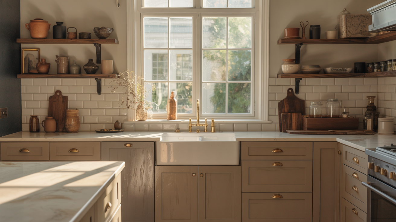
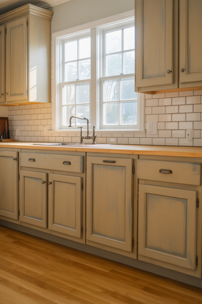
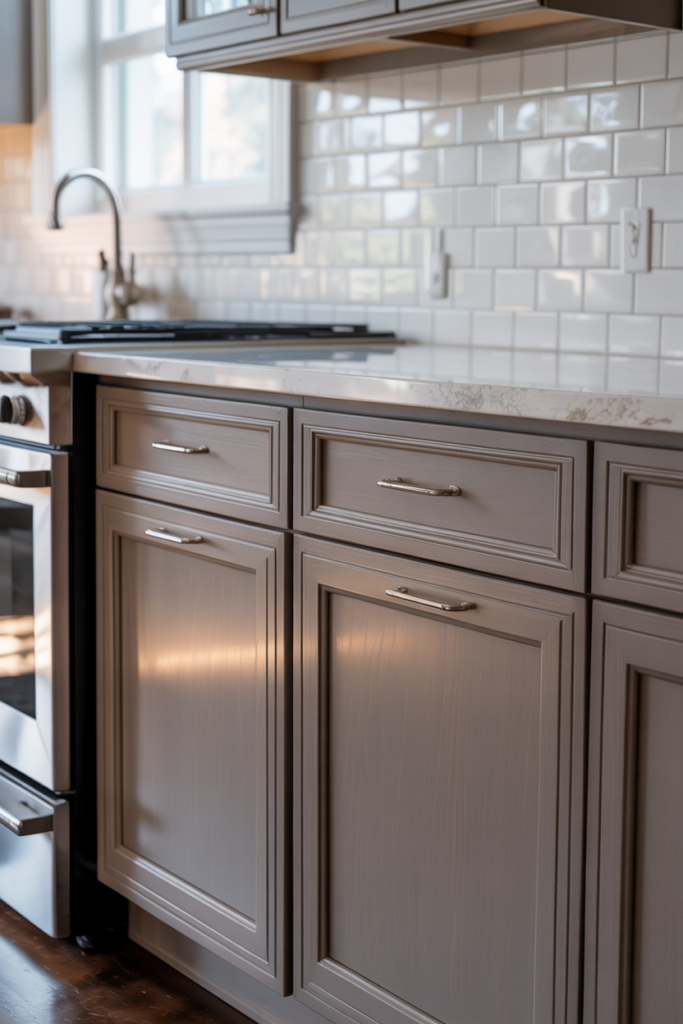
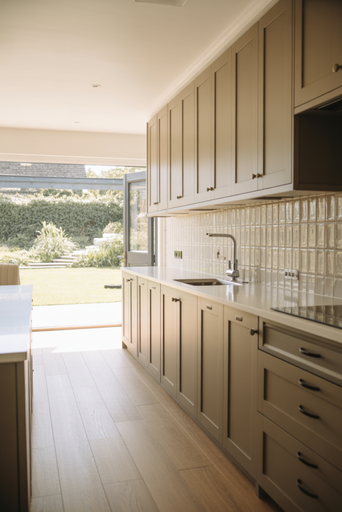
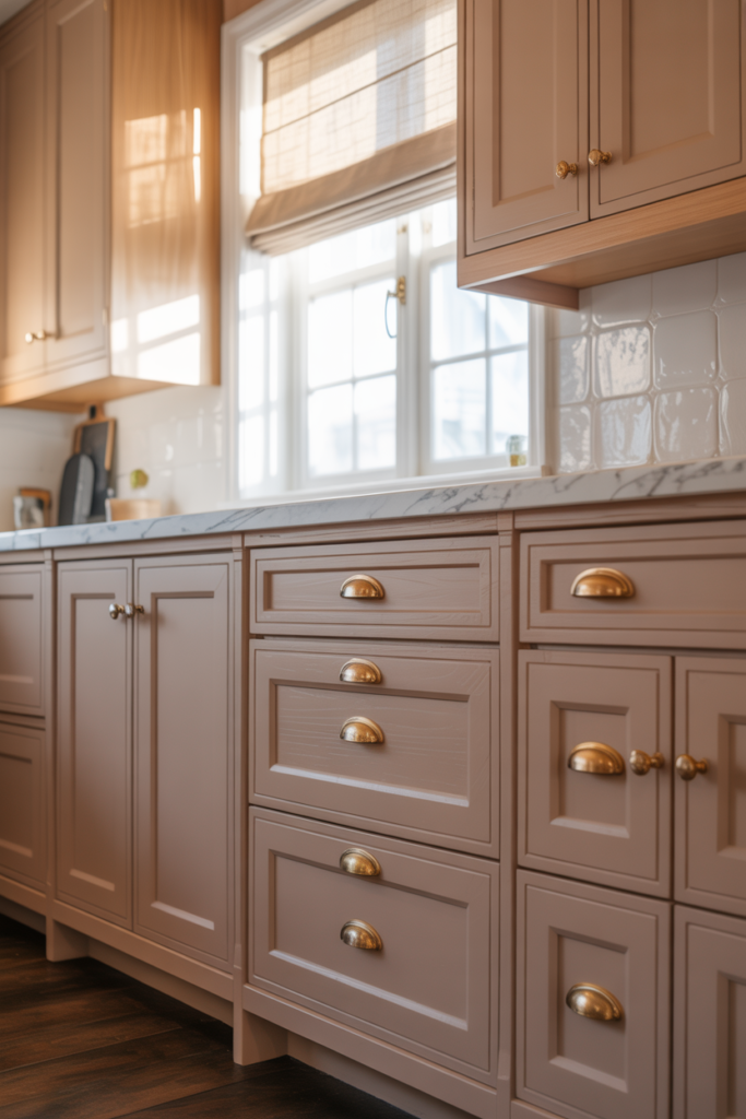
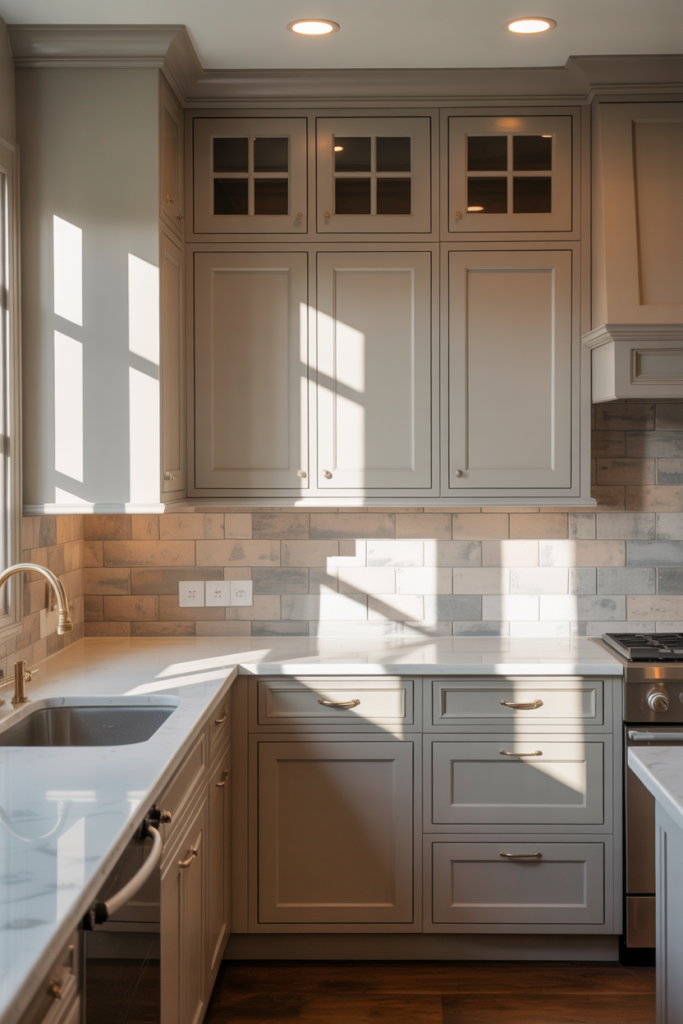
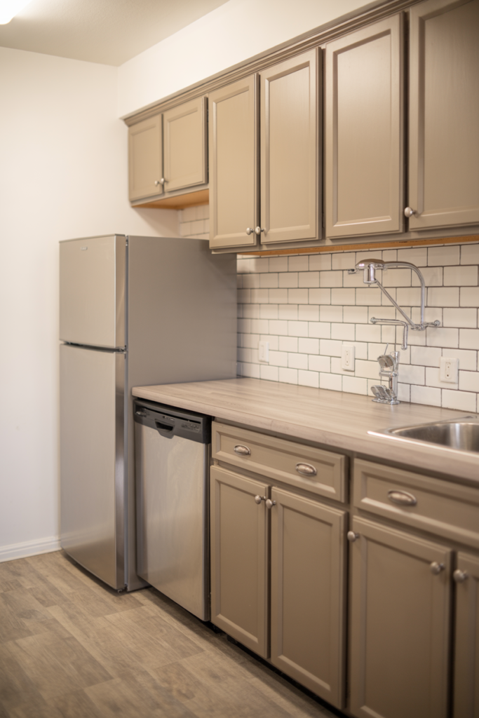
Taupe is one of those colors that sounds boring until you actually see it on kitchen cabinets. Then suddenly everything clicks. It is warm without being yellow, neutral without being cold, and sophisticated without trying too hard. If you have been staring at your kitchen cabinets wondering why they feel off, there is a good chance taupe is the answer you have been looking for.
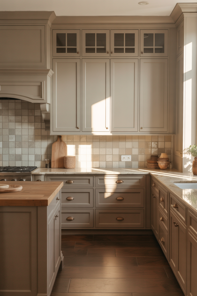
The best taupe kitchen cabinet paint colors sit in that perfect middle ground between beige and grey. They pick up warmth from natural light, play beautifully with wood tones and stone countertops, and age gracefully as design trends shift around them. I have seen taupe cabinets look just as good in a farmhouse kitchen as in a sleek contemporary one, which tells you everything about how versatile this color family really is.
This list covers 15 of the top taupe paint colors for kitchen cabinets across a range of undertones, depths, and finish types. Whether your kitchen gets great natural light or sits on the darker side, there is a taupe shade here that will work hard and look beautiful doing it.
Why Taupe Kitchen Cabinets Work Better Than Most People Expect
Taupe kitchen cabinets work so well because they solve the two biggest problems homeowners face with cabinet color: warmth and versatility. Pure white cabinets can feel sterile and show every mark. Dark cabinets can overwhelm a smaller kitchen. Taupe sits comfortably between both extremes and delivers a kitchen that feels genuinely inviting without requiring everything else to be perfect around it.
The undertones in taupe paint colors are what make or break the result. Some taupe shades pull warm with pink or yellow undertones that complement cream countertops and brass hardware beautifully. Others lean cooler with grey or green undertones that pair better with white quartz and brushed nickel fixtures. Understanding the undertone of your chosen taupe before committing to a full cabinet paint job saves a significant amount of frustration and repainting.
Taupe also photographs exceptionally well, which matters more than people admit. A kitchen that looks good in natural light, in evening light, and in photos tends to feel better to spend time in generally. The slightly complex, layered quality of a good taupe paint color responds to different light conditions in ways that flat white or solid grey simply cannot match.
| Taupe Undertone | Best Paired With | Hardware Finish | Light Condition |
| Warm pink-beige | Cream countertops, wood floors | Unlacquered brass, bronze | Any light level |
| Warm yellow-beige | Butcher block, terracotta tile | Aged brass, copper | Good natural light |
| Cool grey-taupe | White quartz, marble | Brushed nickel, chrome | Bright kitchens |
| Green-grey taupe | Concrete, soapstone | Matte black, gunmetal | North-facing kitchens |
| True balanced taupe | Almost anything | Any finishing works | Any light level |
1. Accessible Beige by Sherwin-Williams for a Soft Warm Taupe That Suits Any Kitchen
Accessible Beige (SW 7036) is one of the most consistently popular taupe cabinet colors for good reason. It sits in that sweet spot of warm without being orange, neutral without being grey, and light enough to keep a kitchen feeling open and airy. I have seen this color on shaker cabinets in both traditional and transitional kitchens, and it rarely disappoints.
The warm, beige quality of Accessible Beige works particularly well with natural wood elements like open shelving, hardwood floors, or butcher block countertops. It pulls out the warmth in timber tones without competing with them. Pair it with oil-rubbed bronze or unlacquered brass hardware for the most harmonious result.
In kitchens with good natural light, Accessible Beige reads as a clean, warm neutral that feels fresh and welcoming. In lower light conditions, it deepens slightly toward a richer beige tone that still works well. This is genuinely one of the safest and most satisfying taupe choices available for kitchen cabinets at any level of renovation.
2. Revere Pewter by Benjamin Moore for a Classic Grey-Taupe With Timeless Appeal
Revere Pewter (HC-172) became so popular that it almost became a cliché, but there is a reason it stayed at the top of neutral paint color lists for over a decade. On kitchen cabinets, it delivers a sophisticated grey-taupe that reads differently in every light condition throughout the day. Morning light brings out its warmer beige side while evening light pulls it toward a cooler greige tone.
This color works especially well in kitchens with white or light grey countertops, where a warmer cabinet color provides the contrast and visual warmth the space needs. The slightly complex undertone of Revere Pewter means it never looks flat or one-dimensional on cabinet doors, which is a significant advantage in a space where you are seeing the same surfaces every single day.
Hardware pairing matters a lot with Revere Pewter. Brushed nickel and matte black both complement its cool-leaning undertone cleanly. For a warmer interpretation, aged brass pulls work beautifully and shift the overall kitchen palette noticeably toward a more traditional feel.
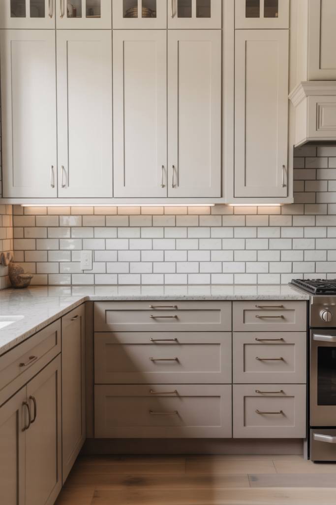
3. Agreeable Gray by Sherwin-Williams for the Lightest and Most Versatile Taupe Cabinet Color
Agreeable Gray (SW 7029) is technically classified as a greige rather than a pure taupe, but on kitchen cabinets, it reads as the lightest and most neutral taupe you can choose. It is warm enough to avoid the cold clinical feeling of true grey and light enough to keep smaller kitchens from feeling heavy or closed in. For anyone nervous about committing to a deeper taupe, this is the most forgiving starting point.
The beauty of Agreeable Gray on cabinets is how cleanly it pairs with almost any countertop material. White marble, cream quartz, dark granite, butcher block, and even concrete all sit comfortably alongside this color without clashing or competing. That flexibility makes it a particularly strong choice for kitchens where the countertops are already in place, and the cabinets need to work around them.
In terms of finish, Agreeable Gray looks best on cabinets in a satin or semi-gloss sheen. The slight reflectivity of these finishes adds depth to what is inherently a very light color and keeps the cabinets looking polished and deliberate rather than flat and matte.
4. Pale Oak by Benjamin Moore for a Soft Pink-Taupe That Adds Warmth Without Going Beige
Pale Oak (OC-20) is one of the most beautiful soft taupe paint colors available for kitchen cabinets. It carries a gentle pink-beige undertone that adds warmth and a slightly feminine quality without tipping into full blush territory. On shaker-style cabinets in particular, Pale Oak creates a kitchen atmosphere that feels genuinely luxurious and considered.
This color performs best in kitchens with good natural light, where its warm undertone comes alive properly. In north-facing kitchens with limited daylight, Pale Oak can pull slightly more pink than intended, which changes the overall feeling of the space significantly. Always test this one with a large sample in your specific kitchen lighting before committing.
Pair Pale Oak cabinets with warm white or cream countertops, natural stone backsplash tiles, and unlacquered brass or warm bronze hardware for the most cohesive and intentional result. The combination reads as quietly elegant and works particularly well in transitional kitchens that blend traditional cabinetry with contemporary fixtures.
5. Muslin by Sherwin-Williams for a Creamy Warm Taupe With a Soft Organic Quality
Muslin (SW 6133) sits on the warmer, creamier end of the taupe family and brings a soft, organic quality to kitchen cabinets that feels genuinely fresh and livable. It is lighter than most mid-taupe choices but carries more warmth and depth than a standard off-white. For kitchens aiming for a relaxed, natural aesthetic rather than a formal or polished look, Muslin is a genuinely excellent choice.
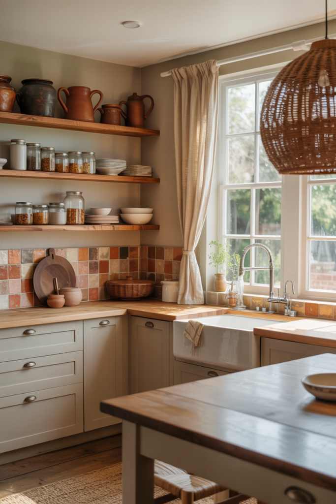
The warmth in Muslin pairs naturally with natural materials like rattan, linen, unpainted timber shelving, and woven pendants. It suits farmhouse and coastal kitchen styles particularly well and works beautifully alongside warm terracotta or handmade ceramic tile backsplashes. I find this color works especially well in open plan spaces where the kitchen cabinets need to sit harmoniously within a larger living area without demanding too much attention.
On a practical note, Muslin is light enough to keep smaller kitchens feeling open while still delivering the warmth that makes a kitchen feel welcoming rather than clinical. It is one of those colors that people often cannot specifically identify when they walk into a kitchen, but immediately feel the positive effect of.
6. Balanced Beige by Sherwin-Williams for a True Middle-Ground Taupe That Never Feels Dated
Balanced Beige (SW 7037) lives up to its name in a way that very few paint colors actually do. It sits almost perfectly between warm beige and cool grey, making it one of the most genuinely balanced taupe options available for kitchen cabinets. If you have spent hours going back and forth between beige and grey and cannot commit to either, this color decides for you.
What makes Balanced Beige particularly useful on kitchen cabinets is how consistently it performs across different light conditions. It does not swing dramatically warm in the afternoon sun or turn unexpectedly cool under overhead lighting the way some taupe shades do. That stability makes it a reliable choice for kitchens that experience significant light variation throughout the day.
Pair Balanced Beige with warm white uppers if you want a two-tone kitchen, or use it throughout for a cohesive enveloping look. It works equally well with both warm and cool hardware finishes, which gives you genuine flexibility when choosing fixtures and fittings. For a kitchen that needs to feel calm, grounded, and quietly stylish, this color consistently delivers.
7. Edgecomb Gray by Benjamin Moore for a Soft Cool-Taupe That Feels Light and Refined
Edgecomb Gray (HC-173) is Benjamin Moore’s answer to the demand for a taupe that leans cooler and lighter without losing its warmth entirely. On kitchen cabinets, it reads as a soft, refined greige with just enough warmth to prevent it from feeling cold or clinical. This is the taupe shade I recommend most often for kitchens with white marble or light quartz countertops, where a warmer taupe might create too much contrast.
The cool-leaning quality of Edgecomb Gray makes it a natural partner for brushed nickel, polished chrome, and matte black hardware finishes. It also sits beautifully alongside subway tile backsplashes in classic white or soft grey, creating a kitchen palette that feels clean, considered, and easy to live with long term. In kitchens with good natural light, this color has a genuinely luminous quality that photographs exceptionally well.
One thing worth knowing about Edgecomb Gray is that it can pull slightly purple or lilac in certain artificial lighting conditions, particularly under warm incandescent bulbs. Testing it under your kitchen’s actual lighting before painting all the cabinets is always the right move with this color. Under natural light and cool LED lighting, it performs beautifully and consistently.
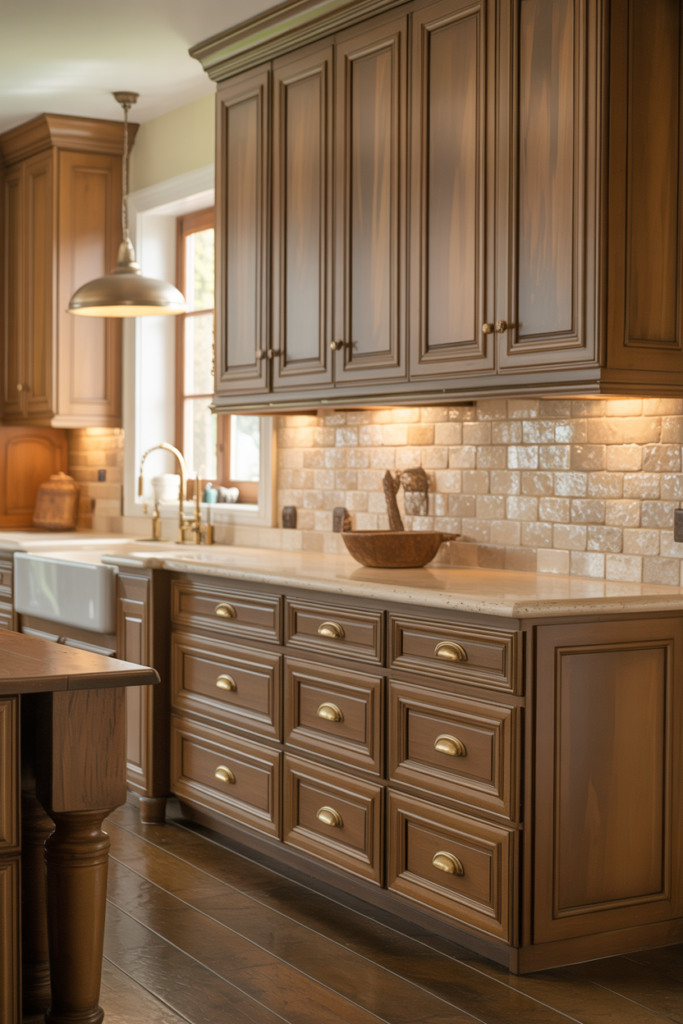
8. Camel Back by Sherwin-Williams for a Deeper Warm Taupe With Rich Character and Depth
Camel Back (SW 6122) steps away from the lighter taupe shades and brings a noticeably deeper, richer warmth to kitchen cabinets. It carries strong yellow-beige undertones that give it a genuinely luxurious quality, particularly on full overlay shaker cabinets with simple hardware. For kitchens that currently feel too bright, too stark, or too cold, this deeper taupe delivers immediate warmth and visual weight.
This color works best in kitchens with good natural light, where its depth reads as rich and intentional rather than heavy and dark. Pair it with natural stone countertops in cream, beige, or warm white tones to complement its warmth without overwhelming it. Dark countertops in black or very deep grey tend to fight against Camel Back rather than working with it, so lighter counter materials consistently produce the best results.
Hardware in aged brass, unlacquered brass, or warm bronze finishes pairs particularly well with this color and amplifies its warm, slightly traditional character. For a kitchen that wants to feel genuinely cozy and enveloping rather than bright and airy, Camel Back is one of the strongest, deepest taupe choices you can make.
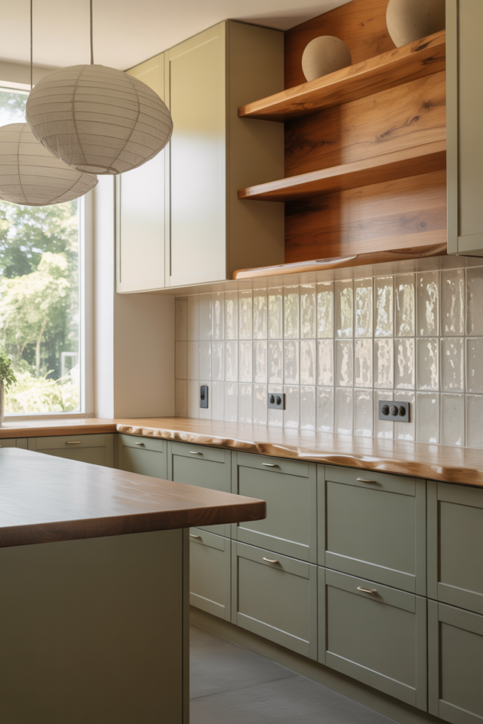
9. Heron Plume by Sherwin-Williams for a Subtle Green-Taupe That Feels Organic and Current
Heron Plume (SW 6070) sits in the green-grey end of the taupe family and brings a quietly organic, earthy quality to kitchen cabinets that feels very much in step with current interior design directions. It reads as a soft, warm taupe in most light conditions but carries just enough green to give it genuine character and prevent it from feeling generic. For kitchens aiming for a nature-inspired or Japandi-influenced aesthetic, this is a standout choice.
The green undertone in Heron Plume pairs beautifully with natural materials, including wood, stone, linen, and ceramic. It works particularly well alongside butcher block or live edge wood countertops and backsplash tiles in handmade terracotta or matte white ceramic. The combination creates a kitchen that feels grounded and genuinely connected to natural textures in a way that more standard taupe shades rarely achieve.
Matte black hardware is the strongest pairing for Heron Plume cabinets, reinforcing the earthy organic quality of the color without competing with it. Aged brass also works well for a slightly warmer interpretation. This color performs consistently across both good and limited natural light conditions, which makes it a more forgiving choice than some of the lighter, more undertone-sensitive taupe shades on this list.
10. Navajo White by Benjamin Moore for a Warm Creamy Taupe That Brightens a Kitchen Beautifully
Navajo White (OC-95) sits at the lightest and creamiest end of the taupe spectrum and brings a warm, softly glowing quality to kitchen cabinets that works particularly well in smaller or darker kitchens. It is warm enough to feel welcoming and inviting, but light enough to reflect natural light and keep the space feeling open. For anyone who loves the warmth of taupe but worries about making a kitchen feel heavy or enclosed, Navajo White is the answer.
This color performs beautifully on both upper and lower cabinets used throughout, creating a soft, unified kitchen palette that feels quiet and harmonious. It pairs naturally with warm white or cream walls, natural timber flooring, and open shelving in a lighter wood tone. The overall effect is a kitchen that feels genuinely bright and airy while still carrying enough warmth to avoid the cold, sterile quality of a true white cabinet.
Hardware in brushed gold, warm brass, or aged bronze finishes lifts Navajo White cabinets into a more deliberately styled territory. The combination of this creamy taupe with warm metallic hardware creates a kitchen palette that feels both current and timeless simultaneously. For open-plan homes where the kitchen flows into a living area, this color transitions between spaces gracefully without creating a jarring visual boundary.
| Paint Color | Brand | Undertone | Light Reflection Value | Best Kitchen Style |
| Accessible Beige SW 7036 | Sherwin-Williams | Warm greige | 58 | Traditional, transitional |
| Revere Pewter HC-172 | Benjamin Moore | Cool grey-taupe | 45 | Transitional, contemporary |
| Agreeable Gray SW 7029 | Sherwin-Williams | Warm greige | 60 | Any style |
| Pale Oak OC-20 | Benjamin Moore | Pink-beige | 68 | Transitional, traditional |
| Muslin SW 6133 | Sherwin-Williams | Warm cream-taupe | 63 | Farmhouse, coastal |
| Balanced Beige SW 7037 | Sherwin-Williams | True balanced | 47 | Any style |
| Edgecomb Gray HC-173 | Benjamin Moore | Cool greige | 63 | Contemporary, transitional |
| Camel Back SW 6122 | Sherwin-Williams | Deep warm beige | 38 | Traditional, farmhouse |
| Heron Plume SW 6070 | Sherwin-Williams | Green-grey taupe | 55 | Organic, Japandi |
| Navajo White OC-95 | Benjamin Moore | Warm cream | 70 | Cottage, farmhouse |
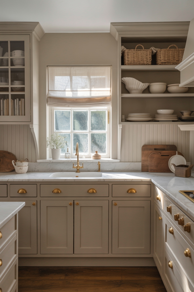
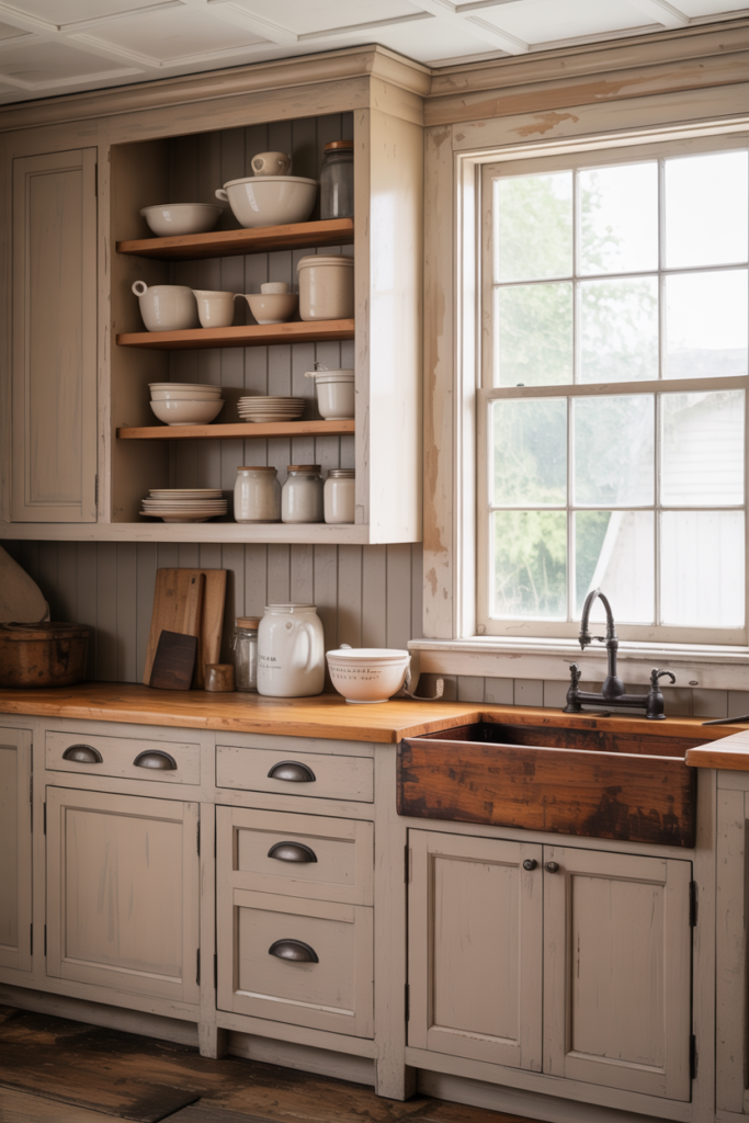
11. Antique White by Sherwin-Williams for a Soft Warm Taupe That Bridges Cream and Greige
Antique White (SW 6119) sits in a fascinating position within the taupe family. It reads as a creamy warm white at first glance, but reveals a genuine taupe quality as the light changes throughout the day. On kitchen cabinets, it delivers a soft, aged elegance that pure white simply cannot replicate. For kitchens that want warmth and lightness in equal measure, this color strikes that balance better than almost anything else on this list.
This color works particularly well in farmhouse, cottage, and traditional kitchen styles where a slightly aged, lived-in quality suits the overall aesthetic. Pair it with open wooden shelving, butcher block countertops, and simple shaker cabinet doors for a kitchen that feels genuinely authentic rather than over-designed. Antique White also works well as a lighter upper cabinet color paired with a deeper taupe on the lowers for a two-tone kitchen arrangement.
Hardware in oil-rubbed bronze, aged brass, or simple black iron suits Antique White cabinets beautifully and reinforces the quietly traditional character of the color. Avoid very cool or modern hardware finishes like polished chrome or brushed nickel, as these tend to fight against the warmth in this color rather than complement it.
12. Collingwood by Benjamin Moore for a Greige Taupe That Shifts Beautifully With Changing Light
Collingwood (OC-28) is one of those paint colors that genuinely surprises people when they see it in their own kitchen after living with a sample for a few days. It shifts noticeably between a warm beige in bright natural light and a cooler, more sophisticated greige in the evening under artificial lighting. That chameleon quality makes kitchen cabinets painted in Collingwood feel like they belong fully in the space at every hour of the day.
The balanced quality of Collingwood means it pairs well with a wide range of countertop materials and backsplash choices. White marble, cream quartz, warm granite, and even dark soapstone all sit comfortably alongside this color. It is one of the few taupe shades that genuinely works with both warm and cool countertop tones without requiring you to carefully coordinate every element of the kitchen around it.
For hardware, brushed nickel and matte black both complement Collingwood’s shifting quality well. Warm brass hardware works beautifully in kitchens that get strong natural light, where the warmer side of this color comes out most strongly. In lower-light kitchens, cooler hardware finishes tend to balance the color more successfully.
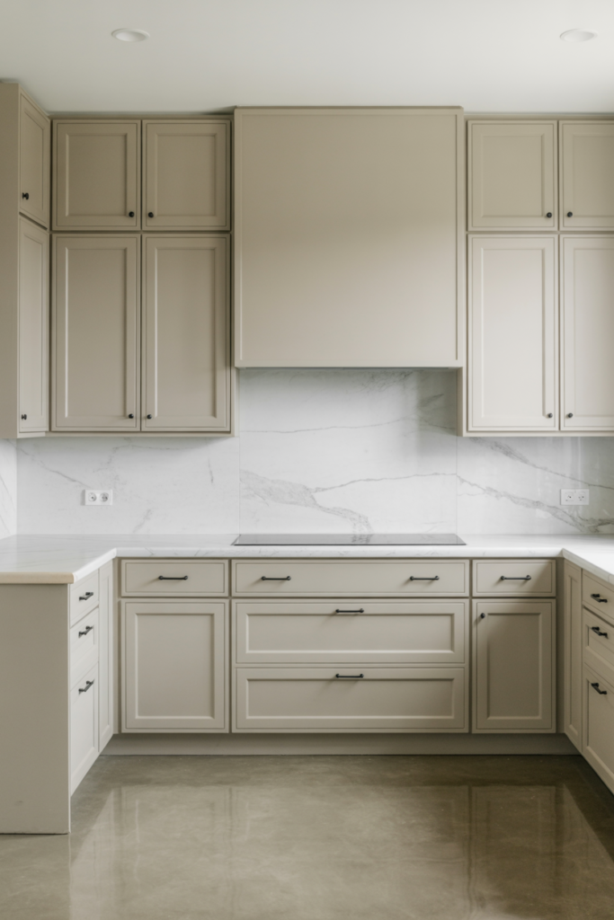
13. Sparrow by Benjamin Moore for a Deeper Earthy Taupe With a Strong Design Personality
Sparrow (HC-101) steps confidently into deeper taupe territory and brings a genuinely strong design personality to kitchen cabinets. It carries warm brown and slight green undertones that give it an earthy, grounded quality that feels both current and enduring. For homeowners who find lighter taupe shades too safe or too predictable, Sparrow delivers real character without going so dark that the kitchen feels heavy.
This color works best on lower cabinets in a two-tone kitchen arrangement, paired with a significantly lighter upper cabinet color like Agreeable Gray or Simply White. The contrast between a deeper earthy taupe on the lowers and a soft neutral on the uppers creates a kitchen that feels visually anchored and genuinely designed rather than simply painted. Island cabinets in Sparrow also look outstanding when the perimeter cabinets use a lighter complementary shade.
Natural stone countertops in cream, warm white, or soft beige tones complement Sparrow most naturally. Dark countertops risk making the overall kitchen feel too heavy when combined with a deeper cabinet color like this. Matte black or aged bronze hardware reinforces the earthy, grounded quality of the color and keeps the whole palette feeling cohesive and considered.
14. Classic Taupe by Valspar for an Affordable and Accurately Named Taupe Cabinet Color
Classic Taupe by Valspar does exactly what its name promises, which in the paint world is rarer than you might think. It sits squarely in the middle of the taupe spectrum with balanced warm and cool qualities that make it one of the most genuinely versatile and accessible taupe cabinet colors available. For budget-conscious kitchen updates where quality and color accuracy both matter, this is a strong and reliable choice.
Classic Taupe performs consistently across a range of kitchen styles from traditional shaker to simple flat-front contemporary cabinets. It lacks the brand recognition of Sherwin-Williams and Benjamin Moore options, but holds its own in terms of color quality and finish when applied correctly. I find it particularly useful for rental properties and budget renovations where a sophisticated look matters, but the investment level needs to stay reasonable.
Pair Classic Taupe cabinets with simple white subway tile backsplash, basic brushed nickel hardware, and laminate countertops in a light stone effect for a kitchen update that looks far more expensive than it actually is. The color does the heavy lifting in terms of sophistication, and keeping everything else simple lets it do that job without competition.
15. Worldly Gray by Sherwin-Williams for a Cool Sophisticated Taupe That Anchors a Modern Kitchen
Worldly Gray (SW 7043) closes this list as one of the most sophisticated and quietly commanding taupe paint colors available for kitchen cabinets. It leans cooler than most entries on this list with a grey-dominant taupe quality that suits contemporary and transitional kitchens particularly well. For kitchens with strong architectural features, high-end appliances, and a more formal design sensibility, Worldly Gray delivers exactly the right level of restraint and sophistication.
This color performs best in kitchens with good natural light or well-designed artificial lighting, where its cool grey-taupe quality reads as intentional and polished. In very dark kitchens, it can feel slightly heavy and flat, so pairing it with under-cabinet lighting and reflective surfaces like glossy tile backsplash or polished stone countertops helps maintain the brightness of the space. White or very light grey upper cabinets paired with Worldly Grey lowers create a two-tone combination that consistently looks high-end and well considered.
Matte black hardware is the strongest pairing for Worldly Gray cabinets and creates a kitchen palette that feels genuinely current and design-forward. Brushed nickel and polished chrome also work well for a cleaner, more minimal interpretation. This is a color that rewards careful lighting design and attention to detail in every other element of the kitchen.
How to Choose the Right Taupe Cabinet Color for Your Specific Kitchen
Choosing the right taupe paint color for your kitchen cabinets comes down to three things: your kitchen’s light conditions, your existing fixed elements, and your personal style preference. Getting all three right before committing to a color saves the time, expense, and frustration of repainting.
Always test your shortlisted taupe colors on the actual cabinet doors rather than on a painted card sample stuck to the wall. Cabinet paint samples look different on a vertical flat surface under room lighting than on a wall sample in a different part of the kitchen. Paint a full cabinet door in each color you are considering and live with it for at least three days before making a final decision.
Pay close attention to how your chosen taupe looks under the artificial lighting you use most in your kitchen. Many taupe shades shift significantly between natural daylight and warm LED or incandescent bulbs. The color you fall in love with in the morning light needs to work just as well when you are cooking dinner under the overhead lights at night.
Conclusion: Finding Your Perfect Taupe Kitchen Cabinet Color
Every taupe paint color on this list proves the same point: taupe kitchen cabinets deliver a warmth, sophistication, and versatility that very few other color families can match. From the lightest creamy options like Muslin and Navajo White to the deeper, more characterful choices like Sparrow and Camel Back, there is a taupe shade here for every kitchen style, every light condition, and every budget.
The key takeaways from this list are straightforward. Understand your kitchen’s undertone needs before choosing a color. Test samples on real cabinet doors under your actual lighting conditions. Match your hardware finish to the warm or cool quality of your chosen taupe. And give yourself a few days with a large sample before committing to the full job.
Taupe kitchen cabinets age beautifully, photograph well, and create a kitchen atmosphere that people consistently describe as warm, welcoming, and sophisticated. That combination is genuinely difficult to achieve with any other color choice at this level of design accessibility. Pick the shade that speaks most clearly to your kitchen’s specific character and go for it with confidence.
Frequently Asked Questions
What is the most popular taupe paint color for kitchen cabinets? Accessible Beige by Sherwin-Williams and Revere Pewter by Benjamin Moore consistently rank as the most popular taupe cabinet colors. Both offer a balanced warm-cool quality that works across a wide range of kitchen styles and light conditions. Agreeable Gray is also extremely popular for those who prefer a lighter, more neutral taupe starting point.
Does taupe work on both upper and lower kitchen cabinets? Taupe works beautifully on both upper and lower cabinets, used consistently throughout a kitchen. Many designers also use a lighter taupe on upper cabinets and a deeper shade on the lowers for a two-tone effect that adds visual depth and interest. The key is keeping the undertones consistent between the two shades so the overall palette feels cohesive.
What countertop colors work best with taupe kitchen cabinets? Warm white, cream, and light beige countertops pair most naturally with warm taupe cabinets. Cool grey or white quartz works best alongside cooler grey-taupe shades. Dark countertops in black or very deep grey can work with lighter taupe cabinets, but tend to overwhelm deeper taupe shades by creating too much contrast.
What hardware finish suits taupe kitchen cabinets best? Warm taupe cabinets pair best with unlacquered brass, aged bronze, or oil-rubbed bronze hardware. Cool grey-taupe shades suit brushed nickel, matte black, or polished chrome finishes most naturally. True balanced taupe shades like Balanced Beige and Collingwood work well with almost any hardware finish, which gives you the most flexibility in your overall kitchen design.
Is taupe a good color choice for small kitchen cabinets? Lighter taupe shades like Agreeable Gray, Pale Oak, Navajo White, and Muslin work very well in small kitchens because they reflect light and keep the space feeling open. Deeper taupe options like Sparrow and Camel Back suit larger kitchens with good natural light better. In a small kitchen, staying in the lighter half of the taupe spectrum consistently produces the best results.
How do I stop my taupe cabinet color from looking too beige or too grey? The key is identifying and matching the undertone of your chosen taupe to the other fixed elements in your kitchen. If your countertops and flooring run warm, choose a taupe with warm undertones to prevent the color from pulling too grey. If your kitchen has cool elements, a cooler grey-taupe prevents the color from reading too beige or yellow. Always test samples in your actual space before committing.
What sheen level works best for taupe kitchen cabinet paint? Satin and semi-gloss finishes both work well for kitchen cabinets as they provide enough reflectivity to add depth to the taupe color while remaining durable and easy to clean. Flat and eggshell finishes are too porous for kitchen cabinetry and show marks and grease easily. Most professional painters recommend a satin finish for the best balance of visual quality and practical durability on kitchen cabinets.