Cream goes with almost everything. That’s not an opinion — that’s just interior design fact. But here’s where most people get stuck: they play it too safe. They pair cream with more cream, add a beige throw, maybe a white vase, and call it a day. The result? A room that feels like a cloud. Pretty, sure. But memorable? Not quite.
The good news is that one bold color is all it takes to change everything. You don’t need a full renovation or a designer on speed dial. A single strong accent color, used smartly, can turn a cream living room from “fine” into something people actually talk about when they visit.
I’ve pulled together 10 cream living room combinations that genuinely work in real homes. These aren’t Pinterest fantasy rooms. They’re ideas you can actually pull off, whether you’re renting, redecorating on a budget, or just tired of your space feeling a little too “safe.”
Why Cream Works So Well as a Base Color
Cream is one of those rare shades that doesn’t fight for attention. It sits quietly in the background, warm and inviting, while letting everything else shine. Unlike stark white, cream carries a natural softness that makes a room feel lived-in rather than staged.
That warmth is actually doing a lot of heavy lifting. Cream tones contain subtle yellow or pink undertones, which means they respond beautifully to natural light. A cream wall at noon looks different from a cream wall at dusk, and both versions are gorgeous. That kind of flexibility is hard to find in a single paint color.
The other reason cream works so well as a base is that it’s neutral without being cold. Cool grays and bright whites can feel clinical if you’re not careful. Cream avoids that problem entirely. It’s the kind of background that makes bold colors pop without creating visual chaos.
| Why Cream Works | What It Does |
| Warm undertones | Makes bold colors feel grounded |
| Soft, non-competing base | Lets accent colors take center stage |
| Works in all light conditions | Looks great morning to evening |
| Feels lived-in, not staged | Creates a relaxed, comfortable vibe |
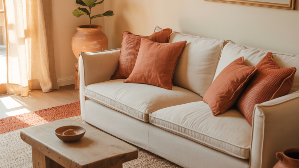
1. Cream and Terracotta: The Warmest Combo in the Room
If warmth is what you’re after, cream and terracotta is the combination I’d recommend first. Terracotta brings this rich, earthy energy that pairs with cream like they were made for each other. It’s cozy without being overwhelming, and it feels connected to nature in a way that instantly relaxes a space.
You don’t need to go wall-to-wall with the color to make it work. A pair of terracotta cushions on a cream sofa, a clay pot in the corner, or a woven rug in rust and sand tones can do the job beautifully. The trick is to let terracotta appear in at least three spots in the room so it feels intentional rather than accidental.
This combo works especially well in rooms with plenty of natural light. The warmth of both colors together can feel heavy in a darker room, so if your living room faces north, balance things out with lighter wood tones and plenty of white in your soft furnishings.
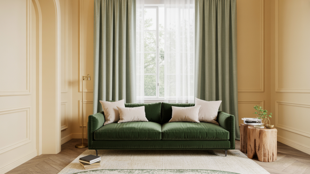
2. Cream and Forest Green: A Classic That Never Gets Old
There’s a reason cream and green has been a go-to in home decor for decades. Green, especially deeper shades like forest, olive, or sage, feels fresh and grounding at the same time. Against cream, it looks sophisticated without trying too hard.
Forest green works best in a cream room when you bring it in through larger pieces. Think a dark green velvet sofa, linen curtains in a deep sage, or a statement armchair. Pairing these with cream walls and natural wood floors creates something that feels timeless rather than trendy.
One thing I’d suggest: don’t mix too many shades of green in the same room. Pick one green tone and stay consistent. This keeps the space looking curated rather than like you raided a garden center.
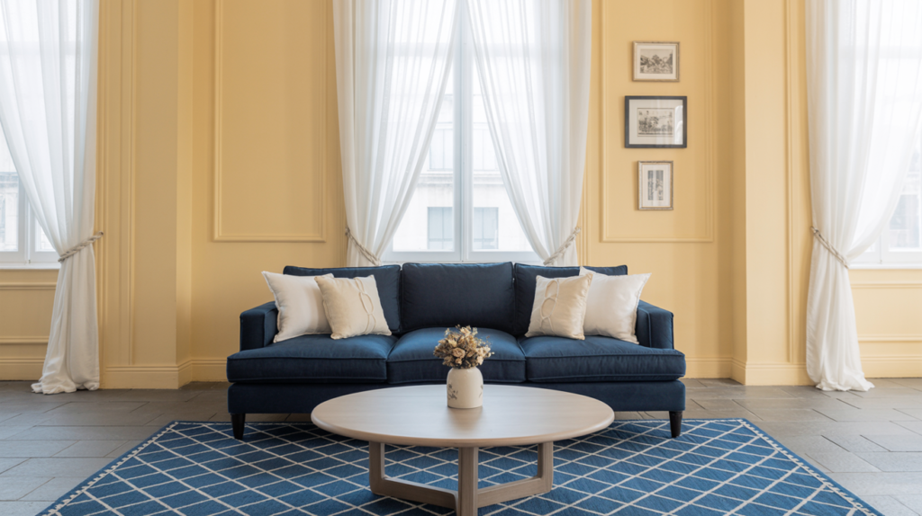
3. Cream and Navy Blue: Sharp, Polished, and Always Impressive
Navy and cream is one of those combinations that photographs beautifully and looks just as good in real life. Navy brings a sense of structure and depth to a room, while cream softens it just enough to keep things from feeling too formal.
This pairing works across different styles too. In a coastal-inspired room, navy and cream feel breezy and relaxed. In a more traditional setting, the same colors look refined and elegant. That versatility makes this one of the most reliable combinations you can choose.
For a balanced look, keep navy to about 20-30% of the room’s color. Navy cushions, a statement navy rug, or a single navy accent wall behind the sofa all work well. Let cream carry the rest of the room, and the contrast will speak for itself.
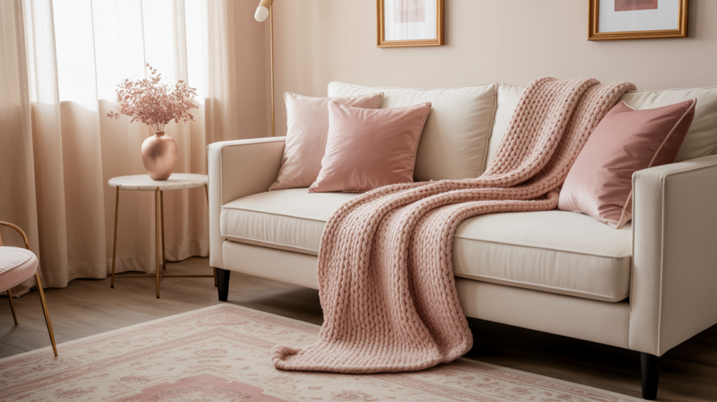
4. Cream and Dusty Rose: Soft but Not Boring
Dusty rose has quietly become one of the most popular accent colors in home decor, and for good reason. It’s warm, it’s romantic, and it doesn’t feel as loud as hot pink or fuchsia. Against cream, it creates a palette that’s soft and feminine without tipping into saccharine territory.
The key with dusty rose is texture. Velvet cushions, a chunky knit throw, or a patterned rug in rose and cream tones all add visual interest without adding visual noise. The more texture you bring in, the richer the room feels.
This combination suits smaller living rooms particularly well. Both colors reflect light softly, which makes a compact space feel more open and inviting. Add a few brass or gold accents, and the whole thing levels up immediately.
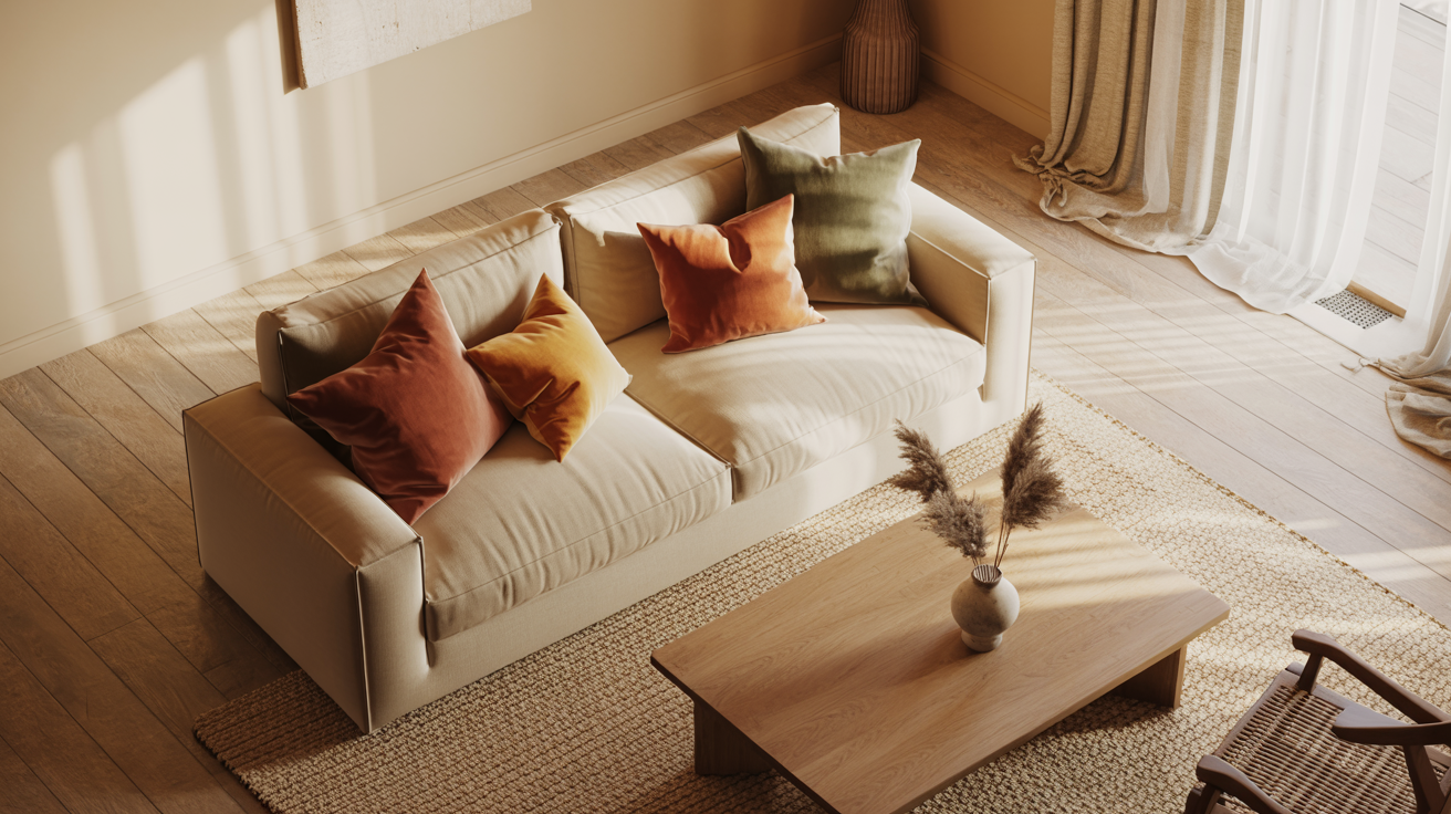
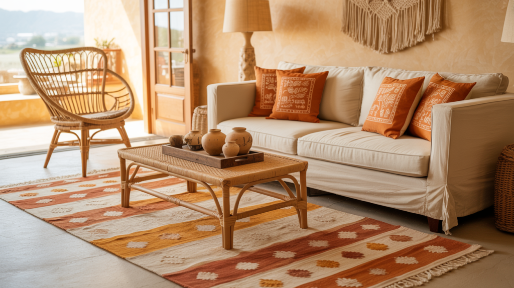
5. Cream and Burnt Orange: Bold Without Being Aggressive
Burnt orange is a shade that a lot of people are afraid to try, and that’s honestly a shame. When used with cream as a base, it’s warm, energetic, and surprisingly easy to live with. It doesn’t shout, it just commands attention in the best possible way.
The easiest way to introduce burnt orange into a cream living room is through textiles. An orange linen throw, a set of block-print cushions, or a kilim rug with orange as the dominant color all bring the energy without committing to anything permanent. If you’re feeling more adventurous, a single painted wall in burnt orange can look genuinely striking behind a cream sofa.
This combination has a slightly bohemian feel, which makes it a great fit for eclectic or maximalist interiors. It also pairs beautifully with natural materials like rattan, jute, and raw wood, so if you love an organic, earthy aesthetic, this one’s worth trying.
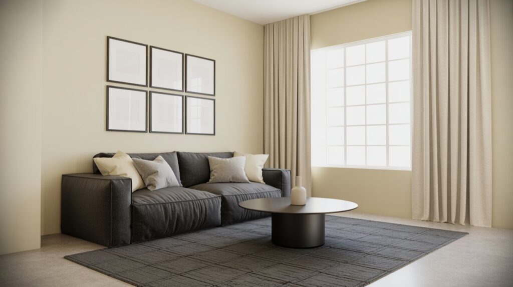
6. Cream and Charcoal: The High-Contrast Combo That Always Delivers
Charcoal and cream is the combination you choose when you want a room to look polished and put-together without spending hours overthinking it. The contrast between the two is strong enough to create visual interest, but neither color fights the other. It’s a pairing that feels grown-up and confident.
The best way to use charcoal in a cream living room is through furniture and soft furnishings rather than walls. A charcoal sofa against cream walls is a classic for a reason. Add a charcoal geometric rug, some dark picture frames, and a few cream cushions on the sofa, and the room balances itself naturally.
If you do want to try charcoal on the walls, keep it to one wall only. A charcoal feature wall behind the sofa or fireplace creates a dramatic anchor point for the room without making the space feel closed in. Cream on the remaining three walls keeps everything light and open.
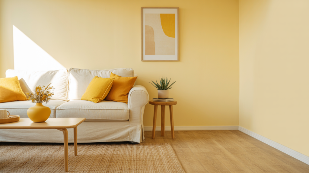
7. Cream and Mustard Yellow: A Cheerful Pair That Works Year-Round
Mustard yellow is one of those colors that sounds risky but delivers every single time when paired with cream. It brings warmth and a touch of cheerfulness to a room without feeling overly bright or childish. Think of it as sunshine that’s been turned down just enough to feel sophisticated.
The easiest entry point with mustard is through accessories. A mustard yellow ceramic vase, a set of cushions in a warm golden tone, or a textured mustard throw draped over a cream armchair all add character without overwhelming the space. Mustard also works beautifully in artwork, so if you’re looking for a way to bring in color without touching your furniture, a statement print with mustard tones is a great starting point.
This combination works across seasons too, which I think makes it particularly smart. In summer it feels bright and energetic, and in winter with some warm lighting and cozy textures, it shifts into something that feels genuinely snug. That kind of year-round appeal is something not every color combination can offer.
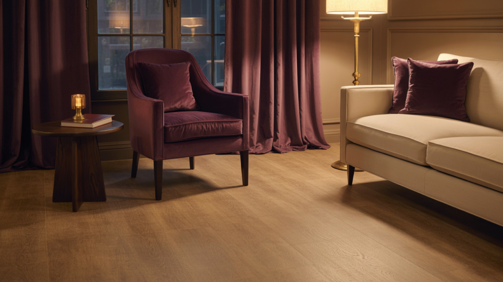
8. Cream and Deep Plum: Rich, Moody, and Completely Underrated
Deep plum is one of the most underused accent colors in home decor, and I genuinely cannot figure out why. Against cream, it creates a rich, layered look that feels luxurious without being overdone. It’s the kind of combination that makes a room feel like it has a personality.
Plum works best in a cream living room when it appears in upholstery or curtains. A plum velvet armchair in the corner of a cream room looks like a deliberate design choice, and it is. Deep plum curtains pooling onto a light wood floor against cream walls create a depth that you simply can’t achieve with softer accent colors.
One thing to keep in mind is that plum can pull either warm or cool depending on the specific shade. Warmer plums with red or brown undertones sit more comfortably with cream than cooler blue-based purples. Always test a swatch or fabric sample in your actual room before committing, because lighting changes everything.
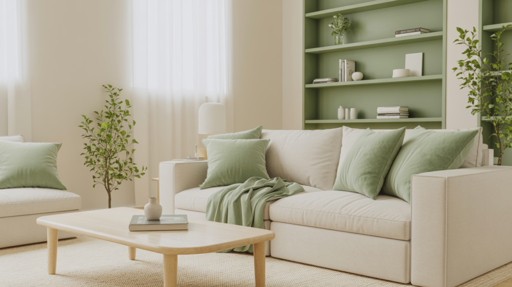
9. Cream and Sage Green: Calm, Fresh, and Easy to Live With
Sage green has had a massive moment in interior design recently, and it shows no sign of slowing down. The reason is simple: it’s one of the most liveable colors out there. It’s cool enough to feel fresh, warm enough to feel comfortable, and neutral enough to work with almost anything, including cream.
In a cream living room, sage green creates a palette that feels connected to the outdoors without going full botanical. Sage linen cushions, a soft green throw, or sage painted built-in shelving all work beautifully. The combination feels particularly good in rooms that get a lot of natural light, where both colors take on a soft, almost luminous quality.
This is also a combination that suits minimalist interiors very well. Both cream and sage are quiet colors that don’t demand attention, so a room using this palette can be fairly simple in terms of decoration and still feel complete. A few plants, some natural textures, and good lighting are all you really need.
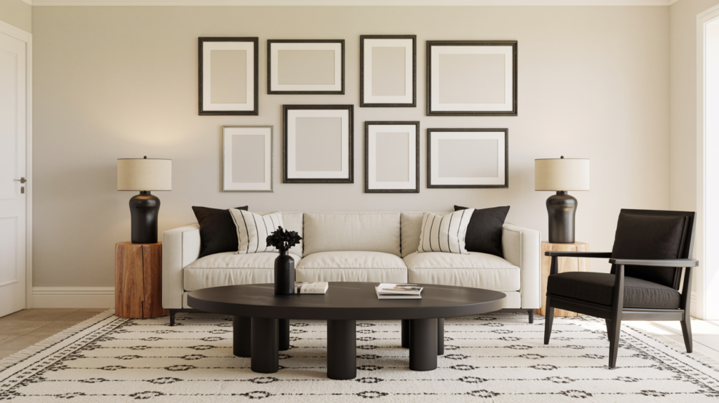
10. Cream and Black: The Boldest Move With the Biggest Payoff
Black might seem like a counterintuitive choice to pair with soft, warm cream, but this is actually one of the most striking combinations you can use in a living room. The contrast is sharp and graphic, but cream stops it from feeling harsh or cold. Together, they create a room that looks intentional and stylishly edited.
The trick with black in a cream room is restraint. Black works best as an accent rather than a dominant presence. Think black picture frames, a black coffee table, black lamp bases, or a single black accent chair. These small hits of black create definition and structure that anchor the cream without overwhelming it.
For a softer version of this combination, swap pure black for very dark charcoal or near-black navy. This gives you the same high-contrast effect with a slightly warmer feel. Either way, this is a combination that photographs beautifully and impresses every single time.
How to Choose the Right Bold Color for Your Cream Living Room
Picking a bold color to pair with cream isn’t just about what looks good on a screen. Your room’s light, size, and existing furniture all play a role in which color will actually work in your specific space. A color that looks stunning in a south-facing room with huge windows might feel heavy and dark in a smaller north-facing space.
Start by thinking about the mood you want the room to have. Warm combinations like cream and terracotta or cream and mustard create rooms that feel cozy and energetic. Cooler pairings like cream and navy or cream and sage lean toward calm and composed. Neither is better, they’re just different, and the right choice depends entirely on how you want to feel when you walk into the room.
The other thing worth considering is how permanent your commitment is. If you’re renting or simply not ready to repaint, start with textiles and accessories. Cushions, throws, rugs, and artwork can introduce a bold accent color without a single drop of paint. Once you’re confident the color works in your space, you can decide whether to take it further.
| Bold Color | Mood It Creates | Best Used In |
| Terracotta | Warm, earthy, cozy | Sun-filled rooms |
| Forest Green | Sophisticated, grounded | Traditional or modern rooms |
| Navy Blue | Polished, structured | Any style or size |
| Dusty Rose | Soft, romantic | Smaller living rooms |
| Burnt Orange | Bold, bohemian | Eclectic interiors |
| Charcoal | Sharp, grown-up | Minimalist spaces |
| Mustard Yellow | Cheerful, warm | Year-round use |
| Deep Plum | Luxurious, moody | Rooms with strong natural light |
| Sage Green | Calm, fresh | Minimalist or Scandi interiors |
| Black | Graphic, striking | Any room needing definition |
Conclusion
A cream living room is honestly one of the best starting points you can have in home decor. It’s warm, it’s flexible, and it plays nicely with almost every bold color out there. The combinations I’ve shared here aren’t just visually appealing, they’re genuinely practical choices that work in real homes with real budgets.
The most important thing to remember is that you don’t need to overhaul your entire room to make a bold color work. Start small. A couple of cushions, a rug, or a single piece of furniture in your chosen accent color is often all it takes to completely shift the feel of a space. Once you see how the color behaves in your room’s light, you can decide how far to take it.
Whether you go for the earthy warmth of terracotta, the polished contrast of navy, or the quiet sophistication of sage green, the cream base will hold everything together beautifully. Pick the combination that excites you most and start there. Your living room will thank you for it.
Frequently Asked Questions
What is the best bold color to pair with a cream living room?
There’s no single answer here because it depends on the mood you want. Terracotta and mustard yellow work best for warm, cozy rooms. Navy blue and charcoal suit spaces where you want a more polished, structured look. Start with the feeling you’re going for and work backward from there.
Can I use more than one bold color in a cream living room?
You can, but I’d keep it to two at most. Using more than two bold colors in a single room can start to feel chaotic rather than curated. If you want to use multiple colors, make sure they share a similar tone or undertone so the room feels cohesive rather than busy.
Does cream work with both warm and cool accent colors?
Cream works better with warm accent colors because of its natural yellow or pink undertones. That said, cooler colors like navy and sage still pair beautifully with cream because cream is soft enough not to clash. Just avoid very cool, icy tones like bright blue or cool gray, as these can make cream look dingy by comparison.
How much of the bold color should I use in a cream living room?
A good rule of thumb is the 60-30-10 rule. Let cream cover about 60% of the room, your secondary neutral or wood tones take up around 30%, and your bold accent color fill the remaining 10%. This keeps the room feeling balanced rather than overwhelming.
What textures work best in a cream and bold color living room?
Natural textures like linen, jute, rattan, and raw wood all work beautifully in cream-based rooms. They add warmth and visual interest without competing with your bold accent color. Velvet is another great option for upholstery in accent colors like plum, navy, or forest green.