
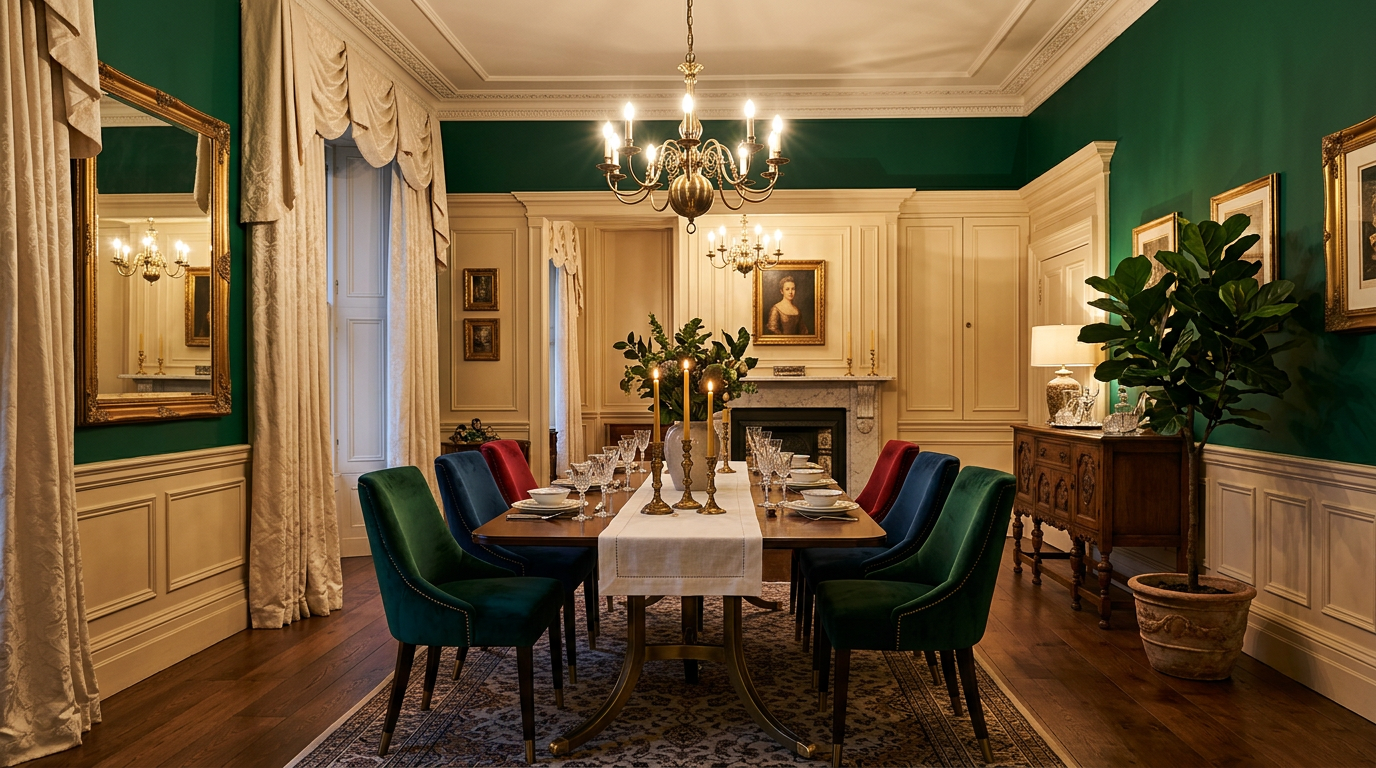
When most people think of Victorian dining rooms, they picture deep black walls paired with burgundy accents. This classic combination feels safe, traditional, and undeniably elegant. But here’s what I’ve discovered through exploring countless dining room designs: Victorian color palettes offer so much more depth than these two predictable choices.
Modern Victorian dining room color palettes have evolved far beyond the typical black and burgundy combination. You can absolutely create that sophisticated, period-inspired aesthetic while using fresh colors that feel contemporary and personal. I’ve found that the best Victorian dining rooms blend historical elegance with unexpected color choices.
The beauty of Victorian design lies in its boldness and layering. This era celebrated rich, saturated colors and dramatic contrasts. By understanding how Victorians used color, you can create a dining room that honors that heritage while reflecting your own taste and lifestyle. Let me show you the alternatives that work beautifully.
Why Victorian Color Palettes Still Dominate Modern Dining Rooms
Victorian design continues to influence interior decorators and homeowners because it communicates sophistication without feeling cold or sterile. The color choices in this era were intentional, layered, and designed to create drama and warmth simultaneously. That’s something modern minimalism often lacks.
I’ve noticed that people gravitate toward Victorian dining rooms when they want their space to feel important. A burgundy wall with gold trim says “this is where meaningful conversations happen.” But you don’t need burgundy to achieve that impact. Deep greens, navy blues, and even muted purples carry the same weight and gravitas.
The color psychology behind Victorian palettes works because these are naturally sophisticated hues. They’re saturated without being neon, dramatic without being overwhelming, and timeless without feeling dated. When you choose colors thoughtfully, your dining room becomes a space where people want to linger.
1. Deep Jewel Tones with Cream: A Sophisticated Alternative
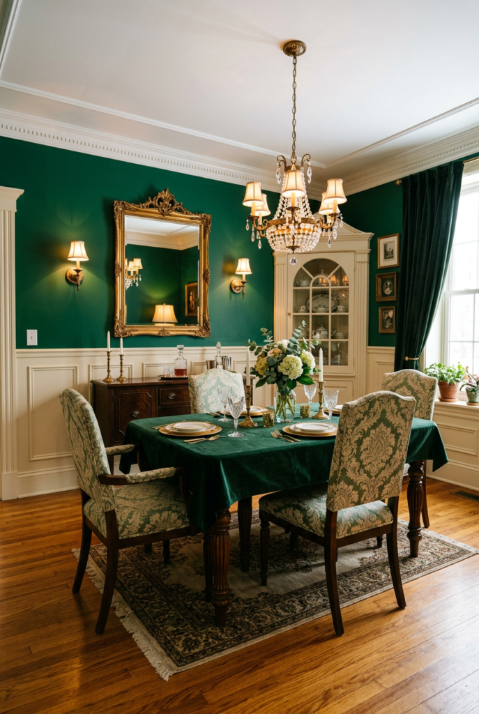
Jewel tones are having a major moment in interior design, and they work spectacularly in Victorian-inspired dining rooms. Think emerald green, sapphire blue, amethyst purple, and ruby red. These colors carry the same richness as burgundy but feel fresher and more intentional.
I recommend pairing jewel tones with warm cream or ivory trim for maximum impact. This combination creates visual breathing room while keeping the drama intact. A deep emerald accent wall with cream wainscoting and white ceiling creates a luxurious frame for your dining space. The jewel tone grounds the room while the cream prevents it from feeling dark or cave-like.
You can layer jewel tones by using them on walls, in upholstery, and through artwork. A sapphire blue wall with jewel-toned velvet dining chairs and amber lighting creates an incredibly inviting atmosphere. The key is balancing saturation with lighter neutrals so the space stays cohesive.
2. Blush Pink and Sage Green: The Romantic Alternative
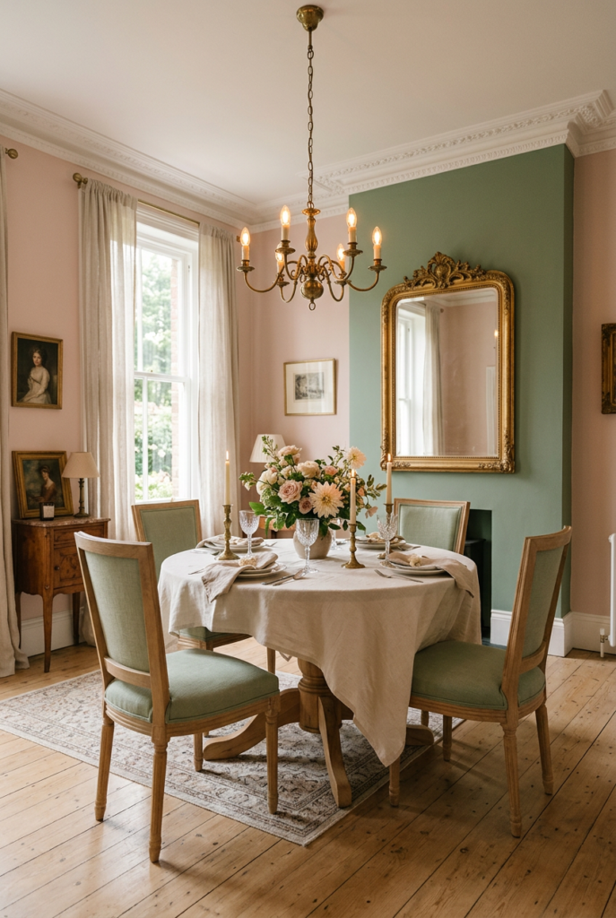
If deep colors feel too intense, blush pink paired with sage green offers Victorian elegance with a softer approach. This combination works especially well in smaller dining rooms or spaces with limited natural light. Blush creates warmth while sage adds balance and sophistication.
I’ve seen this palette work beautifully when blush pink appears on walls and sage green shows up in textiles, artwork, or a single accent wall. The colors complement each other naturally and create a refined, approachable atmosphere. This is perfect if you want Victorian style but prefer rooms that feel serene rather than dramatic.
The blush and sage combination appeals to people who love the period’s elegance but want their dining room to feel intimate and welcoming. Pair this palette with brass or gold fixtures, soft lighting, and natural wood furniture for an authentic Victorian feel with contemporary sensibility.
3. Navy Blue with Gold Accents: Timeless Elegance
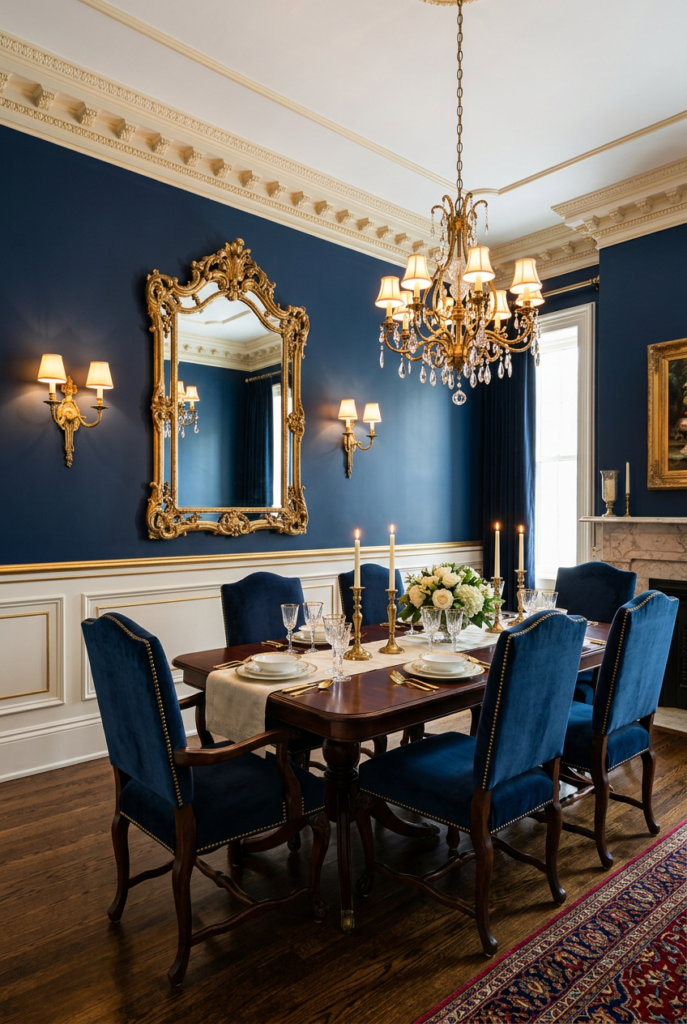
Navy is the thinking person’s alternative to black. It carries authority and depth while feeling slightly warmer and less severe. Combined with gold accents, navy creates an unmistakably Victorian aesthetic that never goes out of style. This palette works in large dining rooms and small spaces equally well.
I love navy in Victorian dining rooms because it photographs beautifully and adapts to different lighting conditions. During the day, it’s deep and grounding. Under warm dining lights, it becomes almost jewel-like. Pair it with gold-framed mirrors, brass chandeliers, and warm-toned wood for authentic Victorian sophistication.
Navy walls with gold-trimmed wainscoting and cream chair rails create architectural interest without overwhelming the space. Add upholstered dining chairs in navy velvet with gold nail head trim, and you’ve created a showstopping room. This palette feels expensive and considered without requiring an enormous budget.
4. Forest Green with Warm Neutrals: Natural Sophistication
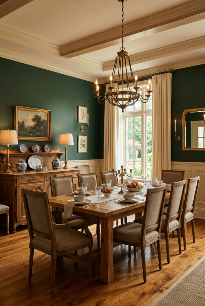
Forest green brings nature into your dining room while maintaining that Victorian sense of refined elegance. This color pair beautifully with warm neutrals like taupe, cream, and soft gold. The combination feels sophisticated without being pretentious or historically rigid.
I find forest green works particularly well in dining rooms with traditional wood furniture or architectural details. The color complements natural wood tones and creates a cohesive, intentional look. Pair it with cream walls and forest green accents on one wall, or reverse it with forest green walls and cream trim for different effects.
The beauty of forest green is its versatility. You can use it as a dramatic feature wall, paint all four walls for a cocoon-like intimacy, or introduce it through textiles and artwork. Combined with natural textures like wood, linen, and stone, this palette creates a dining room that feels grounded and welcoming.
5. Plum and Lavender: The Unexpected Choice
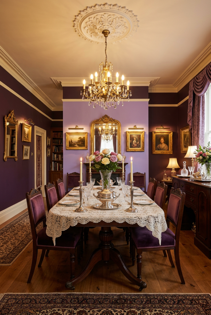
Purple might seem like an unconventional dining room color, but muted plum and lavender shades offer genuine Victorian sophistication. These colors feel luxurious and slightly mysterious while remaining approachable. They work beautifully with both traditional and transitional decor.
I’ve found that plum works better than brighter purples for dining spaces because it carries more visual weight and seriousness. A plum accent wall with lavender trim or vice versa creates depth and interest. Add brass fixtures and warm lighting to enhance the sophisticated atmosphere.
Plum and lavender appeal to people who want to make a bold design statement. This palette says you have confidence and taste. Pair it with velvet upholstery, ornate mirrors, and soft lighting for an undeniably Victorian-inspired space that still feels contemporary and surprising.
6. Charcoal with Soft Whites: Modern Victorian Restraint
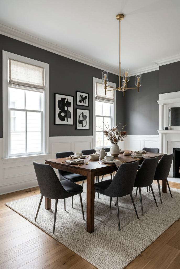
If you love Victorian design but prefer a more neutral foundation, charcoal paired with soft whites delivers period elegance with contemporary restraint. This palette maintains visual drama while feeling less intense than black and burgundy. It’s sophisticated without demanding all the attention in your home.
I recommend using charcoal on walls with crisp white trim and ceiling for maximum architectural impact. This combination creates clean lines and visual clarity. Add depth through textiles, artwork, and lighting rather than relying on color alone. This approach feels very current while honoring Victorian aesthetics.
Charcoal and white works particularly well in homes where your dining room connects to living spaces. The neutral palette creates flow while maintaining the dining room’s defined character. Add Victorian elements through furniture, lighting fixtures, and artwork rather than wall color.
Implementing Your Chosen Victorian Color Palette
Choosing your color palette is just the beginning. Implementation requires thoughtful decisions about which surfaces get which colors, how to balance saturation, and where to introduce supporting hues. I always recommend starting with one color on your walls and building around it.
Paint samples are essential before committing to any color. Bring samples home, observe them in different lighting conditions, and live with them for several days. The color that looks perfect under store lighting might feel different in your actual dining room with your specific lighting and architectural features.
Consider your existing elements too. If you have wood flooring, wood furniture, or specific lighting fixtures, choose a palette that complements these existing pieces. Victorian design works best when colors feel intentional and connected rather than random.
Creating Balance and Preventing Color Fatigue
Selecting a sophisticated color palette is one thing; living with it daily is another. I’ve learned that the most successful Victorian dining rooms balance bold wall colors with breathing room through trim, ceilings, and light-colored textiles. This prevents the space from feeling oppressive or dated.
Use the 60-30-10 rule as a starting point: 60 percent dominant color, 30 percent secondary color, and 10 percent accent color. This creates visual harmony while maintaining drama. If your walls are deep jewel tone, your trim might be cream and your accents might be gold or brass.
Lighting transforms color perception dramatically. Under warm incandescent or LED lighting, colors appear richer and more complex. Under cool white lighting, they can feel harsh. Choose your lighting with your color palette in mind for the best results.
Color Palette Reference Table
| Palette Name | Primary Color | Secondary Color | Trim/Accent | Best For |
| Jewel Tones | Emerald, Sapphire, Amethyst | Cream, Ivory | Gold, Brass | Dramatic elegance |
| Romantic Soft | Blush Pink | Sage Green | Brass, Warm Gold | Intimate spaces |
| Classic Navy | Navy Blue | Cream, Taupe | Gold | Timeless sophistication |
| Natural Green | Forest Green | Cream, Taupe | Warm Gold | Traditional settings |
| Purple Modern | Plum, Lavender | Cream, Soft White | Brass, Gold | Bold personalities |
| Contemporary | Charcoal | White, Off-White | Chrome, Brass | Transitional homes |
Maintaining Your Victorian Color Investment
Once you’ve painted and decorated, maintaining your space matters. High-quality paint in flat or matte finishes works best for Victorian dining rooms because it absorbs light beautifully and creates sophisticated depth. Semi-gloss trim and ceilings create necessary contrast.
I recommend using paint with depth-enhancing properties rather than flat finishes everywhere. Even the most beautiful jewel tone or plum looks one-dimensional under poor paint quality. Invest in premium interior paint for longevity and appearance.
Artwork, textiles, and lighting all contribute to how your color palette appears over time. Rotate artwork seasonally, refresh throw pillows, and adjust lighting seasonally to keep your space feeling intentional rather than static. This prevents even the most beautiful Victorian palette from feeling tired.
Bringing It All Together: Your Victorian Dining Room
Your modern Victorian dining room doesn’t need to follow tradition blindly. Instead, it should reflect your personality while honoring the historical elegance of the era. The color palette you choose communicates something about your taste and values to everyone who dines there.
I’ve shared six alternatives to the predictable black and burgundy combination because I believe your dining room deserves to feel unique. Whether you choose deep jewel tones, romantic pinks and greens, sophisticated navy, natural forest green, unexpected plum, or restrained charcoal, you’re making a deliberate design choice.
Start with paint samples, observe them in different light, and trust your instincts. The best Victorian color palette is one that makes you happy every time you enter your dining room. Your confidence in the color choice will shine through, making the space feel even more beautiful.
Conclusion
Modern Victorian dining room color palettes extend far beyond the traditional black and burgundy combination. You have genuine choices that maintain historical elegance while reflecting contemporary tastes. Whether you prefer jewel tones, soft romantic hues, sophisticated blues, natural greens, unexpected purples, or restrained charcoals, options exist for every personality and space.
The key to success is understanding color psychology, implementing the 60-30-10 balance rule, and maintaining your space with quality materials and intentional styling. Your dining room color palette should feel both dramatic and welcoming, sophisticated and approachable. This balance is what makes Victorian design timeless.
Start your journey with paint samples, observe them in natural and artificial light, and trust your instincts. The perfect color palette for your modern Victorian dining room is one that makes you feel confident and proud every time you dine there.
Frequently Asked Questions
Can I use multiple jewel tones together in a Victorian dining room?
Yes, absolutely. Pair jewel tones on different walls or use them in layers through textiles and artwork. Keep at least 50 percent of the space in neutral tones to prevent overwhelming visual chaos.
Is navy blue too similar to black for Victorian style?
Navy carries authority and depth while feeling slightly warmer than black. Many interior designers prefer navy for Victorian rooms because it photographs beautifully and adapts to different lighting conditions throughout the day.
How do I prevent a dark-colored dining room from feeling cave-like?
Use light-colored trim, ceiling, and adequate lighting. The 60-30-10 rule ensures your dark walls don’t dominate. Add mirrors and reflective surfaces to bounce light around the space.
What lighting works best with deep Victorian color palettes?
Warm incandescent or warm LED lighting (2700K color temperature) complements deep colors beautifully. Dimmer switches allow you to adjust brightness for different times of day and different occasions.
Can I use these palettes in small dining rooms?
Absolutely. Smaller spaces actually benefit from bold color because they create intimate, purposeful environments. Ensure your trim and ceiling are light-colored to maintain visual spaciousness.
Should I paint all four walls or use an accent wall?
Both approaches work for Victorian dining rooms. Four painted walls create immersive drama, while a single accent wall is safer if you’re uncertain. You can always add more color through textiles and artwork later.
How do these color palettes work with modern furniture?
Victorian color palettes work beautifully with modern furniture because they focus on refined, sophisticated hues rather than specific period styles. Your palette creates the Victorian mood while contemporary furniture keeps the space from feeling dated.