If you have been wondering what to do with your living room walls this year, B&Q has the answer. Dulux, one of the most popular paint brands sold at B&Q, named “Rhythm of Blues” as its Colour of the Year for 2026. It is not one shade but three: Mellow Flow, Slow Swing, and Free Groove. Each one brings a different energy, and all three work beautifully in a living room.
I have to say, when I first saw the announcement, I was a little sceptical. Blue in a living room? It sounds like a risk. But the more I looked at the three shades, the more I understood what Dulux was going for. These are not your standard navy or baby blue. They sit in a sophisticated, calm, versatile space that actually suits a wide range of interior styles.
The best part is that all three shades are available through B&Q, either as ready-mixed tins or through their in-store and online paint mixing service. You can pick up a tester pot before committing, which I always recommend. There is nothing worse than painting an entire wall and realising the colour looks completely different in the afternoon light.
What Is the Dulux Colour of the Year 2026 and Why Does It Matter?
Dulux chose “Rhythm of Blues” based on research from their Global Aesthetic Centre, a team that tracks cultural, social, and design trends across the world. The three shades reflect a collective desire for balance, calm, and spaces that feel both personal and restorative. It is a thoughtful pick, and it shows.
Mellow Flow is a soft, muted light blue inspired by cloudless skies. Slow Swing is a deep, dark blue chosen for its grounding and calming qualities. Free Groove is a brighter, more energetic blue that brings a sense of uplift and personality. Together, they give you a full spectrum to work with, from barely-there to genuinely bold.
For living rooms specifically, this palette is a gift. Blue has long been associated with calm, focus, and comfort, which are exactly the qualities you want in a space you use to relax and unwind. Using one or more of these shades through B&Q gives your living room a current, considered look without ever feeling trendy in the wrong way.
| Shade | Tone | Mood | Best For |
|---|---|---|---|
| Mellow Flow | Soft Light Blue | Calm, Airy, Open | Small Living Rooms, Scandi Style |
| Slow Swing | Deep Dark Blue | Grounding, Cosy, Dramatic | Feature Walls, Traditional Rooms |
| Free Groove | Bright Mid Blue | Uplifting, Bold, Energetic | Accent Walls, Modern Spaces |
7 Ways to Use the B&Q Colour of the Year in Your Living Room
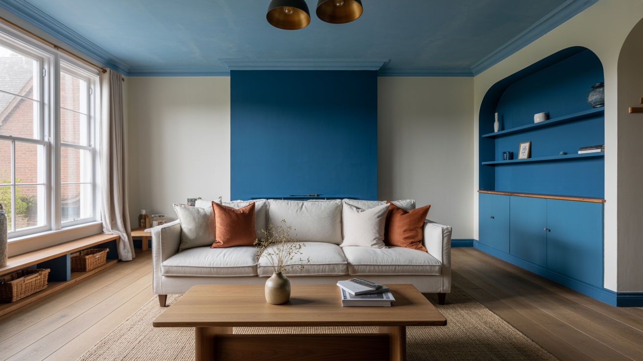
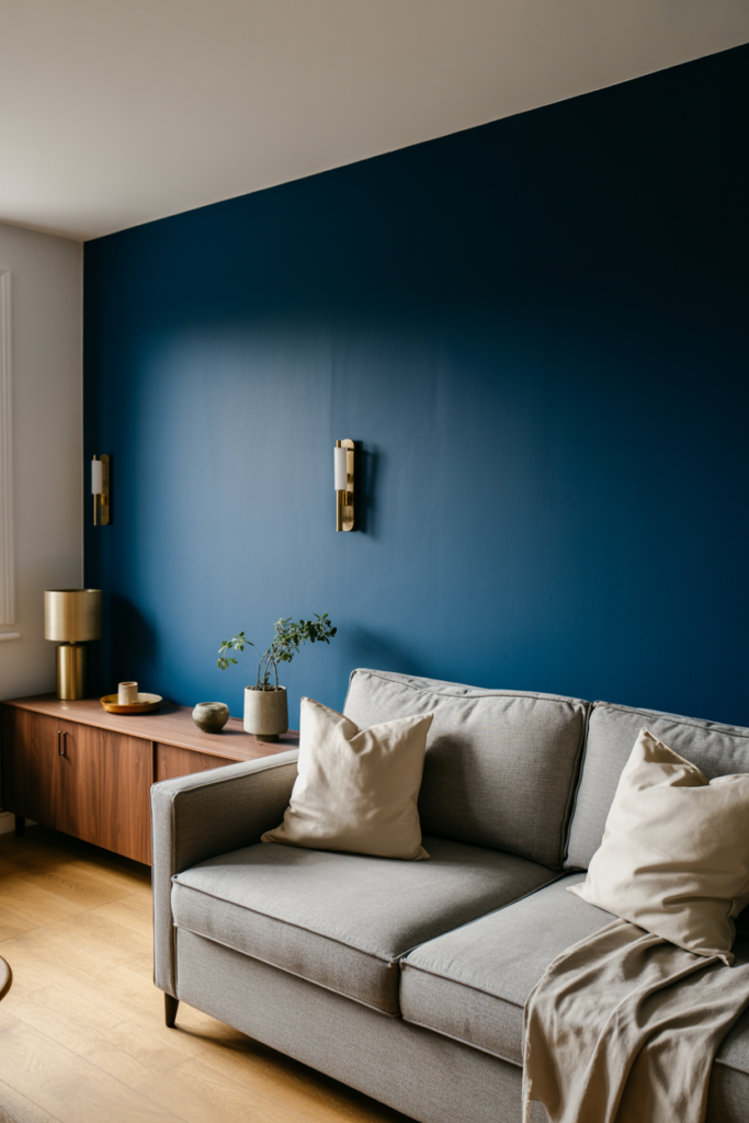
1. Paint a Feature Wall with Slow Swing for a Dramatic Look
Slow Swing is the boldest of the three shades, and it works exceptionally well as a feature wall color. Choose the wall behind your sofa or fireplace and paint it in this deep, rich blue. The rest of the room stays neutral while that one wall anchors the entire space.
I tried a deep blue feature wall in my living room last year, and the impact was instant. The room felt more defined, more intentional, and honestly more grown-up. Slow Swing has that same quality: it adds weight and character without making the room feel closed in.
Pair it with warm brass light fittings, natural wood furniture, and cream or oatmeal soft furnishings. The contrast between the dark blue and the warm neutrals creates a balanced, high-end look that photographs beautifully too.
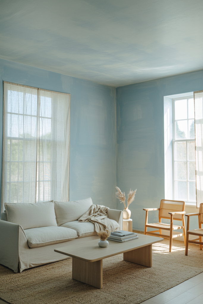
2. Use Mellow Flow for a Full Room Color Wash
Mellow Flow is gentle enough to use on all four walls without overwhelming the space. It reads almost like a warm white in certain lights, but with just enough colour to make the room feel intentional and styled. This is the shade for people who want colour without committing to something too loud.
A full colour wash in Mellow Flow works especially well in living rooms that get good natural light. The shade shifts beautifully throughout the day, looking almost silvery in morning light and softly blue in the afternoon. It is the kind of colour that makes a room feel curated without anyone being able to pinpoint why.
Pair it with linen sofas, jute rugs, and wooden accessories for a Scandinavian-inspired living room. Or combine it with blush pink accents and rattan furniture for something softer and more eclectic. Mellow Flow is genuinely one of the most versatile shades in the Rhythm of Blues palette.
3. Create a Two-Tone Wall with Mellow Flow and Slow Swing
Two-tone walls are one of the biggest living room paint trends right now, and the Rhythm of Blues palette is perfect for it. Paint the lower third of your wall in Slow Swing and the upper portion in Mellow Flow, with a crisp dividing line in between. It adds architectural interest without any structural work.
I find this technique particularly effective in living rooms with high ceilings. The darker shade at the bottom grounds the room visually, while the lighter shade above keeps it feeling open and airy. It is a clever trick that designers use often, and it works every single time.
You can use picture rail height as your dividing line if you have one, which usually sits about a third of the way up from the floor. If not, a simple strip of masking tape and a steady hand will do the job perfectly.
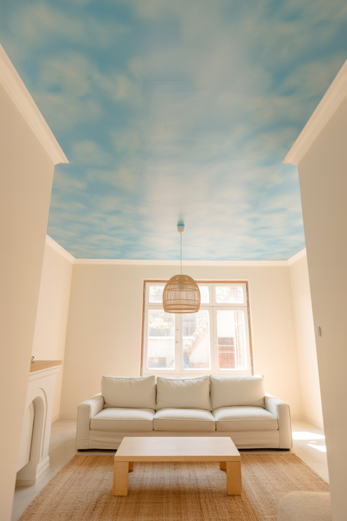
4. Paint the Ceiling with Mellow Flow for a Cozy, Enveloping Effect
Painting the ceiling is something most people overlook, but it changes a room more than almost any other decorating decision. Mellow Flow on the ceiling creates a soft, enveloping effect that makes the living room feel more intimate and considered. It is especially good in rooms with white walls, where the ceiling colour becomes a subtle surprise.
This approach is sometimes called a “fifth wall” treatment, and interior designers have been championing it for a few years. The key is to keep the shade light and soft, which is exactly what Mellow Flow delivers. A deep shade on the ceiling can feel heavy; a light, airy blue feels like looking up at a clear sky.
Try it alongside white walls and warm natural wood tones for a space that feels both modern and welcoming. It is one of those ideas that sounds unusual until you see it in person, and then you wonder why you ever painted ceilings white in the first place.
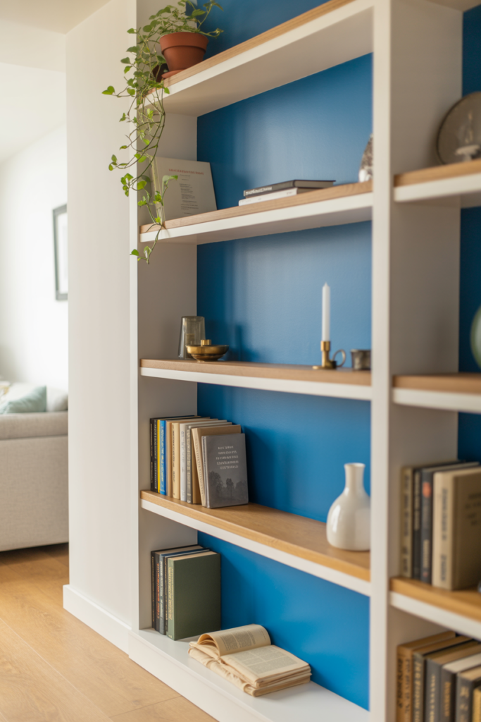
5. Use Free Groove as an Accent on Alcove Shelving
Alcove shelving is a feature in many UK living rooms, and painting the back panel of those alcoves in Free Groove is a fantastic way to add personality without touching the main walls. The bright, uplifting blue peeks out from behind your books, plants, and decorative objects and adds a real pop of energy.
This is one of my favourite low-commitment ways to use a bold colour in a living room. You use very little paint, the effect is big, and you can repaint it in an afternoon if you change your mind. Free Groove works particularly well if your shelving holds a mix of natural wood tones and white or cream accessories.
The colour draws the eye toward the shelving unit, which makes it a natural focal point in the room. If you display books with their spines facing out, the blue backdrop makes them look like a proper, styled home library rather than just a stack of things you have not got round to organising yet.
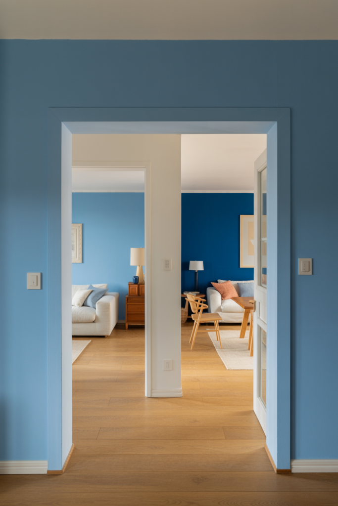
6. Combine All Three Shades Across Different Rooms That Connect
If your living room opens into a hallway, dining room, or open-plan kitchen, you have a great opportunity to use all three Rhythm of Blues shades across connected spaces. Start with Mellow Flow in the lightest, most open area, move to Free Groove in a transition space, and use Slow Swing in the cosiest or most enclosed room.
This technique creates a tonal journey through your home that feels cohesive and professionally planned. It is a method many interior designers use when working with a paint family, and the Rhythm of Blues palette is designed exactly for this kind of layered approach.
The result is a home that feels intentional from the moment you step inside. Each room has its own identity, but the connecting thread of blue ties everything together beautifully.
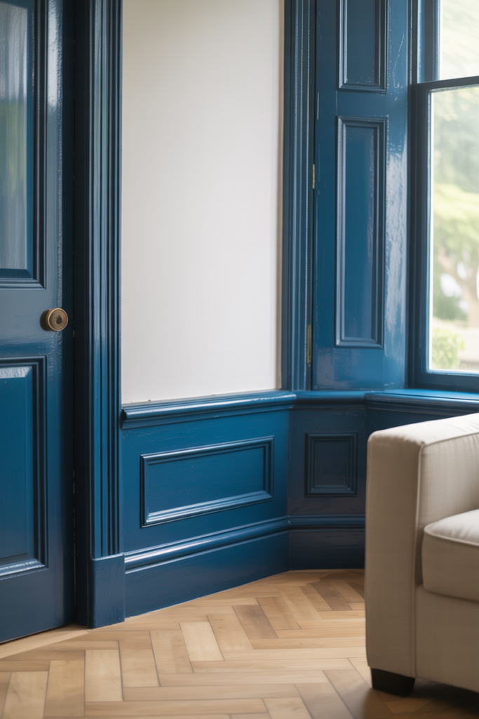
7. Paint Woodwork and Skirting Boards in Slow Swing for a Bold, Contemporary Finish
Painting woodwork in a deep, rich colour rather than white is one of the strongest living room decorating trends right now. Slow Swing on skirting boards, window frames, and architraves gives a living room an incredibly sharp, contemporary edge. Against white or light walls, it looks striking and intentional.
I have seen this done in person and it genuinely transforms the character of a room. The dark blue woodwork creates clear definition between the walls and the floor, almost like a graphic outline around the room. It takes confidence to try, but the results are worth it every time.
This approach suits modern, minimal living rooms particularly well, but it also works in period homes where the existing woodwork detail gets highlighted rather than hidden by the bold colour. Buy a small tin of Slow Swing and test it on one section of skirting board first. Chances are, you will want to paint the rest by the end of the afternoon.
How to Buy the Dulux Rhythm of Blues Range at B&Q
B&Q stocks Dulux paint both in-store and online at diy.com. You can pick up ready-mixed tins of shades from the Rhythm of Blues collection or use B&Q’s paint mixing service to get a precise match in your preferred finish. Matt, silk, and eggshell finishes are all available, depending on the look and durability level you need.
I always recommend ordering tester pots first, especially for deeper shades like Slow Swing. The colour will look different on your specific walls under your specific lighting, and there is no substitute for seeing it in your own space before committing to a full tin. B&Q’s tester pots are affordable and available for next-day delivery or Click and Collect.
| Finish Type | Best Use | Durability | Sheen Level |
|---|---|---|---|
| Matt | Feature Walls, Ceilings | Good | None |
| Silk | High-Traffic Walls | Excellent | Low to Medium |
| Eggshell | Woodwork, Furniture | Very Good | Subtle |
| Satinwood | Skirting, Doors | Excellent | Medium |
Conclusion
The Dulux Colour of the Year 2026, Rhythm of Blues, gives living rooms a colour story that is calm, current, and genuinely versatile. Whether you go for the soft, airy Mellow Flow, the grounding depth of Slow Swing, or the uplifting energy of Free Groove, there is a shade in this palette that works for your space. All three are available at B&Q, making it easy to pick up tester pots and get started without any fuss.
From bold feature walls and two-tone finishes to painted ceilings and alcove accents, the ways to use this palette in your living room are genuinely varied. You do not need to repaint every wall or undertake a major renovation. Even one accent wall or a painted shelving back can transform how your living room looks and feels.
If you have been putting off redecorating because you could not decide on a colour, this is your sign to stop overthinking it. The Rhythm of Blues palette is accessible, well-considered, and designed to last far beyond this single year. Pick your shade, grab a tester pot from B&Q, and go from there.
Frequently Asked Questions
1. Where can I buy the Dulux Rhythm of Blues paint range? You can buy it at B&Q in-store or online at diy.com. It is available in ready-mixed tins and through B&Q’s paint mixing service in a range of finishes and sizes.
2. What is the difference between Mellow Flow, Slow Swing, and Free Groove? Mellow Flow is a soft, light blue inspired by pale skies. Slow Swing is a deep, dark blue with a grounding, calming quality. Free Groove is a brighter mid-tone blue that feels more energetic and uplifting.
3. Which shade works best in a small living room? Mellow Flow works best in smaller spaces because its light, airy tone keeps the room feeling open. You can use it on all four walls without the room feeling closed in or heavy.
4. Can I use Slow Swing on all four walls of my living room? You can, but it works best as a feature wall or two-tone application in most living rooms. On all four walls, it creates a very dramatic, cocooning effect that suits larger rooms with good lighting.
5. What colours pair well with the Rhythm of Blues palette? Warm neutrals like cream, oatmeal, and soft white work beautifully with all three shades. Natural wood tones, brass accents, and terracotta accessories also complement the blues without competing with them.
6. Is Dulux paint at B&Q available in matt and silk finishes? Yes. B&Q stocks Dulux in matt, silk, eggshell, and satinwood finishes. Matt suits walls and ceilings, while silk and eggshell work better for high-traffic walls and woodwork.
7. Do I need to use a primer before painting with a deep shade like Slow Swing? Using a primer is a good idea, especially when covering a lighter or white wall with a deep blue. It reduces the number of coats needed and gives a more even, true finish.