A shelf that holds nothing but books and a forgotten candle from three years ago is not doing its job. Shelves are prime real estate in any room, and the way you style them communicates more about the personality of a space than almost any other decorating decision you make. The difference between a shelf that looks like a storage solution and one that looks like a deliberate design choice comes down entirely to intention and a few simple styling principles.
I spent years treating my bookshelves as purely functional storage before realizing that the most beautiful rooms I kept saving to my phone all had one thing in common: incredibly well-styled shelves. The books were still there, but they shared space with plants, ceramics, framed art, and objects that told a story. That shift from storage thinking to styling thinking changed the way every shelf in my home looked almost overnight.
The good news is that shelf styling does not require expensive objects or a design degree. It requires understanding a handful of principles about scale, color, texture, and negative space, then applying them consistently across whatever shelves you already have. The fifteen ideas on this list cover every shelf type, every room, and every aesthetic from minimal and modern to maximalist and collected.
Why Good Shelf Decor Makes Such a Significant Visual Difference to Every Room It Appears In
Shelves occupy vertical wall space in a way that draws the eye naturally, which makes them one of the most visually influential surfaces in any room. A well-styled shelf creates a focal point that anchors the surrounding furniture arrangement and gives the room a sense of completion that bare walls and empty surfaces never achieve. That focal point quality is why shelf styling delivers such a disproportionately large visual return relative to the effort and cost involved.
The layered quality of a well-styled shelf also adds visual depth to a room in a way that flat wall art cannot replicate. Objects at different depths on a shelf, some pushed to the back, some pulled to the front, create a three-dimensional arrangement that changes slightly as you move through the room. That depth and movement make the space feel more alive and considered than a room where every decorative element sits flat against the wall.
Shelf decor also gives you one of the most flexible and low-commitment decorating canvases available in any home. Restyling a shelf takes twenty minutes and costs nothing if you already own the objects. That ease of change makes shelves the ideal place to experiment with new color combinations, seasonal updates, and evolving personal collections without any of the permanence that comes with paint, wallpaper, or new furniture.
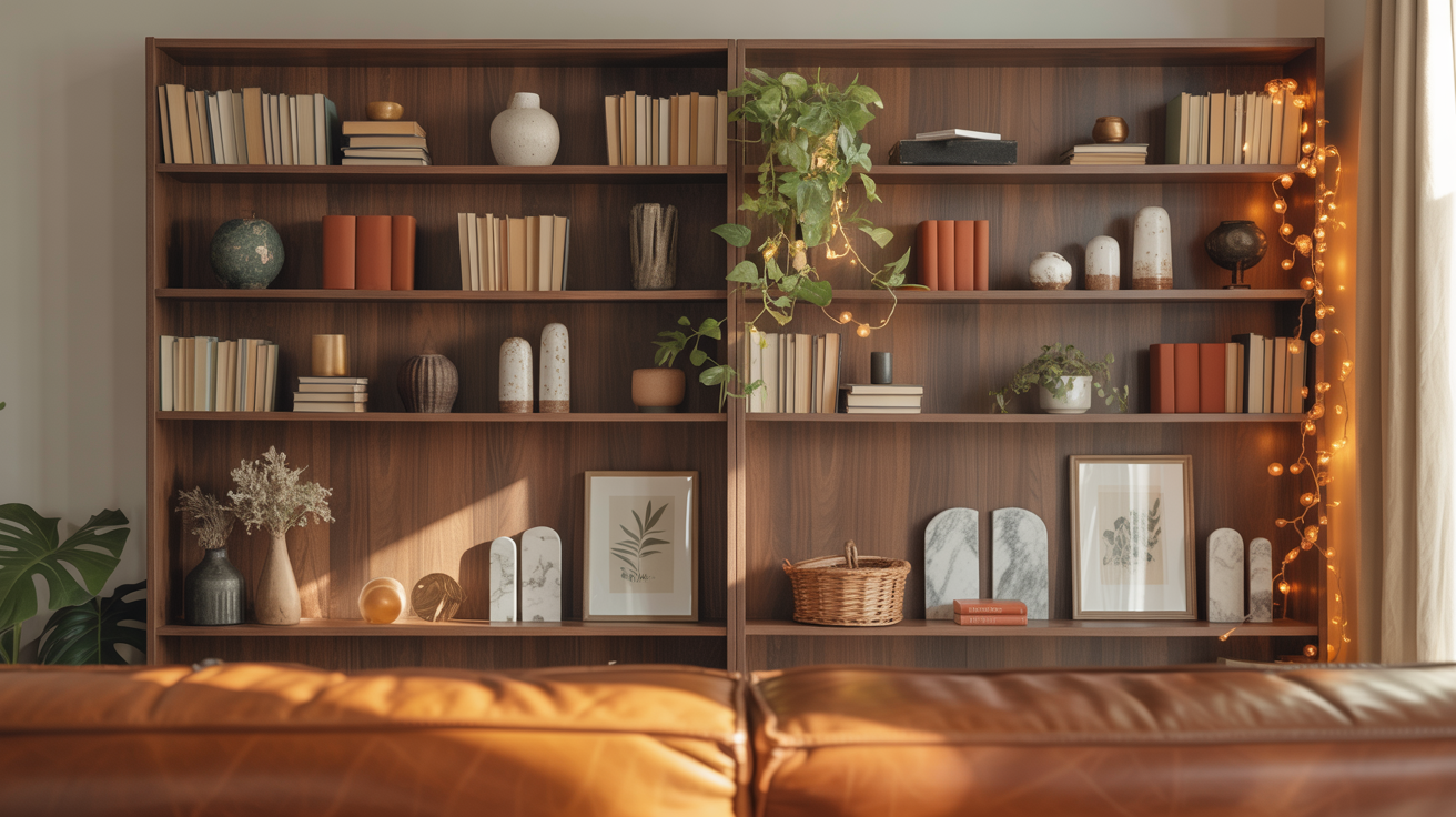
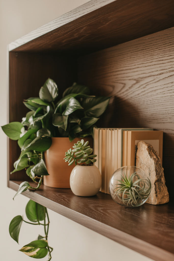
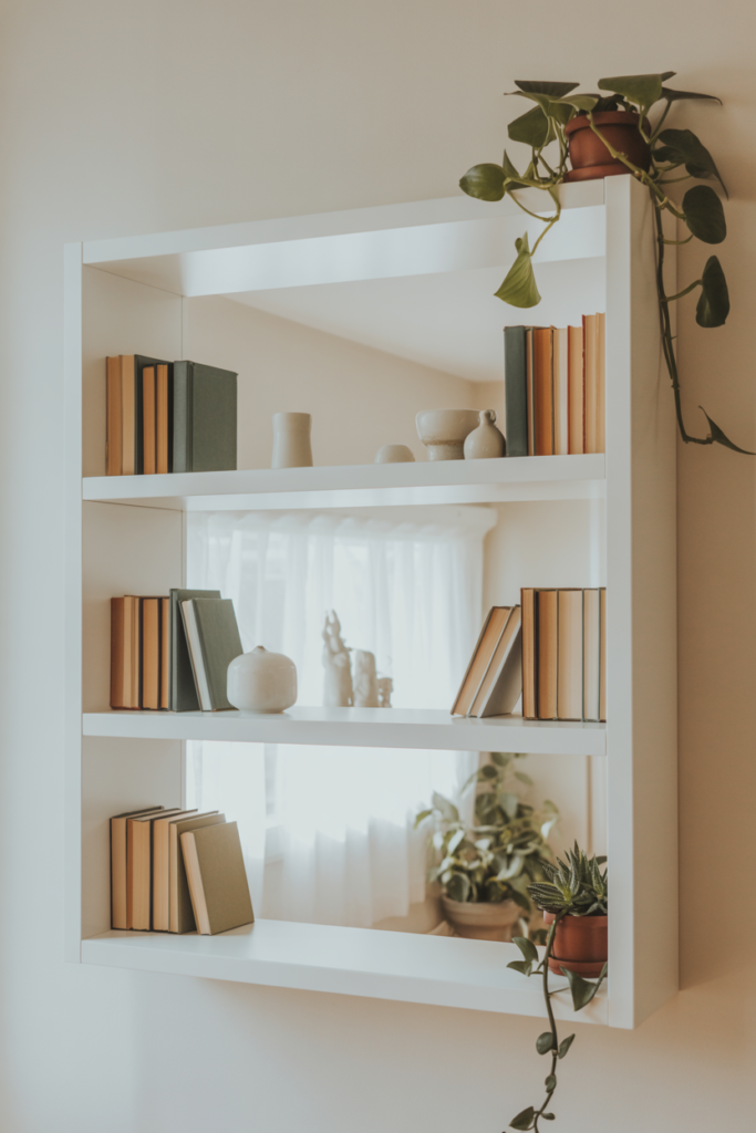
1. Mix Books With Decorative Objects in Grouped Vignettes That Create Visual Interest Across Every Shelf
The most common shelf styling mistake is treating books and decorative objects as two separate categories that alternate predictably across every shelf. Strong shelf styling groups books and objects together in deliberate vignettes where each small arrangement tells its own visual story within the larger shelf composition. A cluster of three books standing upright beside a small ceramic vase and a trailing plant creates a vignette that reads as intentional and designed rather than randomly populated.
Grouping objects in odd numbers, typically threes and fives, produces arrangements that feel naturally balanced without looking symmetrical and stiff. Two objects side by side create a pair that the eye reads as intentional matching, while three objects create a composition with a natural visual hierarchy of tall, medium, and small that draws the eye through the arrangement more dynamically. That odd-number principle applies equally to books, ceramics, plants, and framed objects anywhere on the shelf.
Varying the height within each vignette group prevents the shelf from looking flat and one-dimensional from across the room. A tall stack of horizontal books beside a medium-height ceramic beside a small, low object creates a stepped profile that adds visual movement to the arrangement. That varied height principle is one of the simplest shelf styling rules and one of the most consistently effective, regardless of the specific objects involved.
2. Turn Some Books Backward to Create a Neutral Texture That Balances Bold Decorative Objects on the Shelf
Turning books backward so only the cream or white page edges face outward is one of those shelf styling tricks that sounds strange until you see it in a finished room and immediately understand why it works so well. The backward books create a neutral, textured background element that lets decorative objects in front of them read more clearly, rather than competing with colorful or mismatched book spines for visual attention. It is essentially a built-in neutral backdrop that costs nothing and takes thirty seconds to create.
This technique works particularly well on shelves where the book collection has a very mixed spine color palette that would otherwise create a visually busy backdrop behind more carefully chosen decorative objects. Grouping backward-facing books together in a cluster of five or seven rather than scattering them individually across the shelf creates a more considered effect. The backward book cluster reads as a deliberate texture rather than a randomly turned individual book that looks like it got put back the wrong way.
Mixing backward and forward-facing books on the same shelf adds visual rhythm and prevents the shelf from looking either too busy with competing spine colors or too uniform with only one type of book orientation. A standard approach is to group books by color where possible, then turn any books with clashing or distracting spines backward within that same cluster to create a cleaner section of color or neutral texture on that shelf.
3. Use a Consistent Color Palette Across the Entire Shelf to Create a Cohesive and Intentional Styled Look
Applying a consistent color palette across a bookcase or floating shelf arrangement is the single most effective shelf styling technique for creating a result that looks professionally curated rather than casually assembled. Choosing two or three colors that appear throughout the shelf in books, ceramics, plants, and frames creates a visual thread that ties all the individual objects together into one cohesive composition. Without that color thread, even a shelf full of beautiful individual objects reads as a collection of unrelated things rather than a styled arrangement.
A neutral-dominant palette with one or two accent colors suits most shelf styling contexts well because it keeps the arrangement calm and cohesive, while the accent colors provide enough visual interest to hold attention. Cream, warm white, and natural wood tones as the dominant palette with terracotta and sage green as accent colors create a shelf arrangement that works in almost any living room, bedroom, or home office without clashing with the surrounding decor. The specific accent colors can shift seasonally while the neutral foundation stays consistent throughout the year.
Grouping books by color rather than by author, genre, or size is one of the most visually impactful shelf organization decisions available without spending a single dollar. Arranging books in color gradient sections from warm to cool tones across a bookcase shelf creates a rainbow-inspired display that looks intentional and visually striking from across the room. Color-grouped books also make the shelf much easier to style effectively because the consistent color blocks provide natural starting points for placing decorative objects throughout the arrangement.
4. Add Living Plants to Shelves to Introduce Organic Texture, Color, and Natural Movement to the Display
Living plants on shelves add an organic vitality to shelf styling that no amount of carefully chosen objects can replicate because they grow, move, and change with the light in a way that ceramic and timber objects simply do not. A trailing pothos or string of pearls draping over the edge of a shelf introduces movement and a softness that pulls the eye naturally downward through the shelf arrangement. That downward trailing movement contrasts with the mostly upright profile of books and vases and adds genuine visual dynamism to the composition.
Small potted plants like succulents, cacti, air plants, and small ferns suit shelf environments well because they stay compact enough to fit within a vignette arrangement without overpowering the surrounding objects. Air plants in particular are outstanding shelf decor elements because they require no pot or soil, sit directly on the shelf surface or inside a small glass globe, and add a distinctly architectural quality that suits both modern and organic shelf aesthetics. Positioning a small plant at varying heights across different shelf levels creates a natural visual rhythm that ties the full bookcase composition together from top to bottom.
Low-light-tolerant varieties suit the interior shelf environment most practically because most shelves sit away from windows and receive only ambient indoor light. Pothos, ZZ plants, snake plants in small sizes, and peace lilies all handle low-light shelf conditions reliably without requiring frequent relocation to brighter spots for survival. Choosing varieties that stay healthy and attractive in typical indoor shelf conditions matters more for long-term shelf styling success than choosing plants purely for their visual qualities.
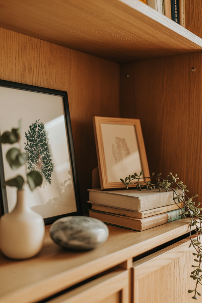
5. Layer Framed Art and Prints Against the Back of the Shelf to Add Depth and a Gallery Quality to the Display
Leaning small framed prints, photographs, or artwork against the back wall of a shelf rather than hanging them on the surrounding wall adds a gallery-inspired layering quality to shelf styling that flat object arrangements rarely achieve. The framed piece provides a backdrop for the objects in front of it, creates an implied depth between the two planes, and introduces an art element to the shelf without requiring any wall hooks or picture hanging hardware. A small framed botanical print leaning behind a ceramic vase and a stack of books creates a composition that looks genuinely styled and considered.
Varying the frame sizes and styles across different shelf sections adds visual interest, while a consistent frame finish, all black, all natural wood, or all antique gold, keeps the gallery quality cohesive rather than scattered. Leaning multiple frames of different sizes overlapping slightly at the back of a single shelf creates a collected, layered effect that suits maximalist and eclectic shelf aesthetics particularly well. The slight overlap between frames adds a casual, lived-in quality that perfectly placed individual frames rarely achieve.
Mixing framed art with unframed prints, postcards, and small canvases creates a more relaxed and personal shelf display than a strictly framed arrangement. An unframed watercolor print leaning against a ceramic vase adds an artist’s studio quality to the shelf that framed pieces in matching frames can sometimes lose. That mix of formal and casual within the same shelf arrangement creates the relaxed intentionality that characterizes the best shelf styling.
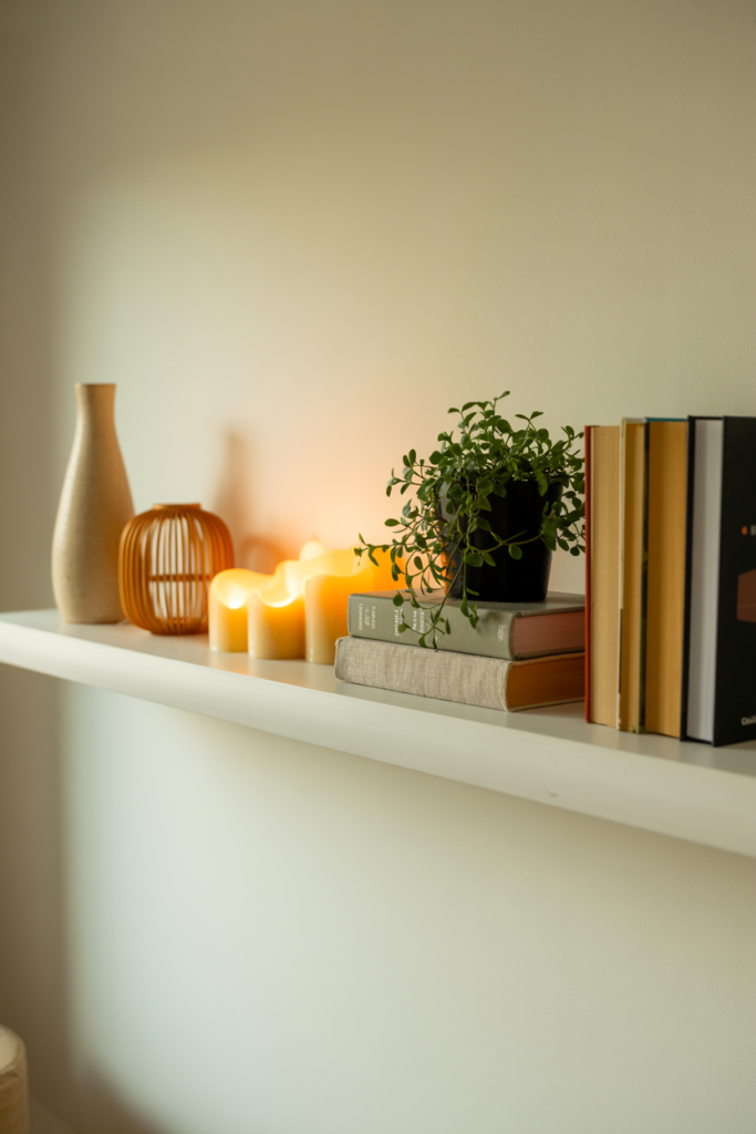
6. Use Varying Heights of Objects to Create Visual Rhythm and Movement Across the Full Shelf Length
Visual rhythm across a shelf comes from the deliberate variation of object heights from one end to the other, and getting this right makes the difference between a shelf that looks actively styled and one that looks like objects were placed wherever they happened to fit. A tall vase at one end, stepping down to a medium ceramic, then a short candle holder, then back up to a stack of books, creates a wave-like profile that draws the eye across the full shelf length in a satisfying visual journey. That rising and falling height variation is what interior designers refer to as shelf rhythm, and it applies to every shelf type in every room.
Stacking books horizontally rather than standing them upright creates instant height variation within a book cluster and also provides a flat platform surface for placing smaller objects on top. A stack of three horizontal books with a small ceramic mushroom or a mini succulent sitting on top creates a two-level vignette within the same footprint as three upright books. That vertical layering within a single cluster adds complexity and visual interest to the shelf without requiring any additional objects beyond what most people already own.
Avoid placing all the tallest objects at the center of the shelf and letting the arrangement taper symmetrically to shorter objects at each end. While that approach creates a kind of visual order, it also creates a static, predictable profile that the eye processes quickly and moves on from. An asymmetric height arrangement where the tallest point sits slightly off-center creates a more dynamic and interesting visual composition that holds attention longer.
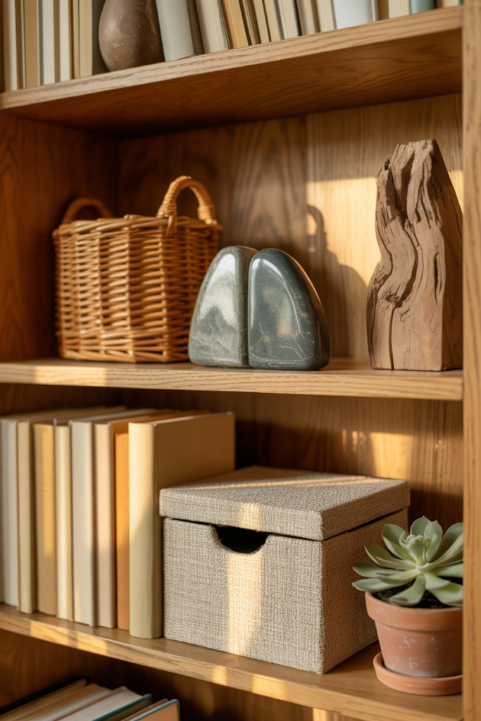
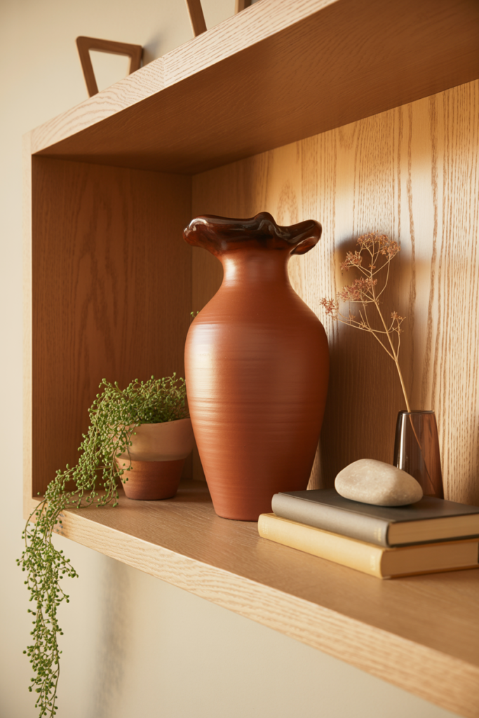
7. Incorporate Natural Textures Like Wood, Rattan, Stone, and Linen to Add Warmth and Material Depth to Shelves
Natural textures on a shelf add a warmth and material richness that painted or synthetic objects rarely achieve, regardless of how carefully they are chosen or arranged. A small rattan basket, a polished stone bookend, a linen-wrapped box, and a raw timber sculpture each introduce a distinct tactile quality to the shelf that creates genuine sensory interest beyond the purely visual. Mixing several natural textures within the same shelf arrangement builds the layered, organic quality that makes shelf styling feel genuinely considered rather than assembled from a single shopping trip.
Rattan and woven objects deserve particular mention as shelf decor elements because they introduce a pattern quality through their woven structure that adds visual complexity without introducing any competing color. A small rattan tray, a woven basket used as a small storage container, or a rattan-wrapped vase adds texture and warmth to a shelf in a completely neutral way that suits almost any surrounding color palette. That neutrally textured quality makes rattan one of the most versatile natural material choices for shelf styling across different rooms and aesthetics.
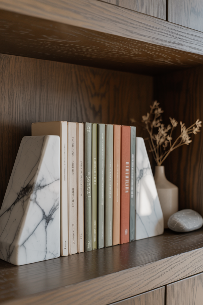
Stone objects like marble bookends, agate slices, geodes, and smooth river stones bring a grounded, earthy quality to shelf arrangements while also introducing natural color variation that adds interest without requiring any purchasing decisions beyond the stone itself. A pair of marble bookends with natural grey veining provides both a functional bookend and a decorative element simultaneously, which is the kind of dual-purpose object that shelf styling benefits from enormously. Functional objects that also look beautiful are always the best shelf decor investments.
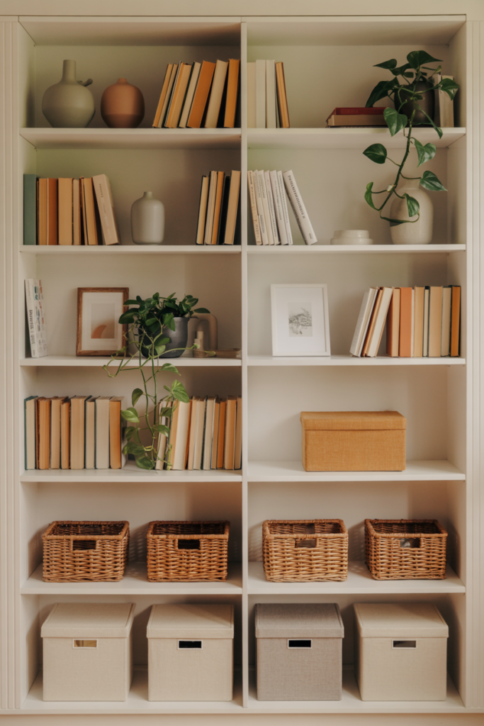
8. Create Negative Space on Shelves Deliberately to Let Individual Objects Breathe and Read More Clearly
Negative space on a shelf is the intentional absence of objects in certain areas, and most people underestimate how much visual work space a shelf arrangement provides. Leaving a portion of a shelf deliberately empty beside a carefully styled vignette makes both the space and the styled section read more clearly and more intentionally than a shelf packed uniformly from end to end. The space gives the eye a place to rest between the styled sections, which makes the overall composition easier and more pleasurable to look at.
A common shelf styling guideline suggests filling roughly sixty to seventy percent of a shelf surface with objects and leaving the remaining thirty to forty percent as intentional negative space. That proportion produces an arrangement that feels curated and considered rather than either cluttered and overwhelming or sparse and unfinished. The specific placement of the negative space matters as much as the amount, so positioning the empty sections between vignette clusters rather than at one end creates a more balanced overall composition.
Resisting the urge to fill every available inch of shelf space is genuinely one of the harder shelf styling disciplines to maintain, particularly for people who own a lot of books and objects and feel the practical pressure to use all the available storage space. The solution is editing the collection of shelf objects down to the best pieces rather than displaying everything simultaneously. A shelf with fifteen carefully chosen objects always looks better than the same shelf with thirty objects competing for attention.
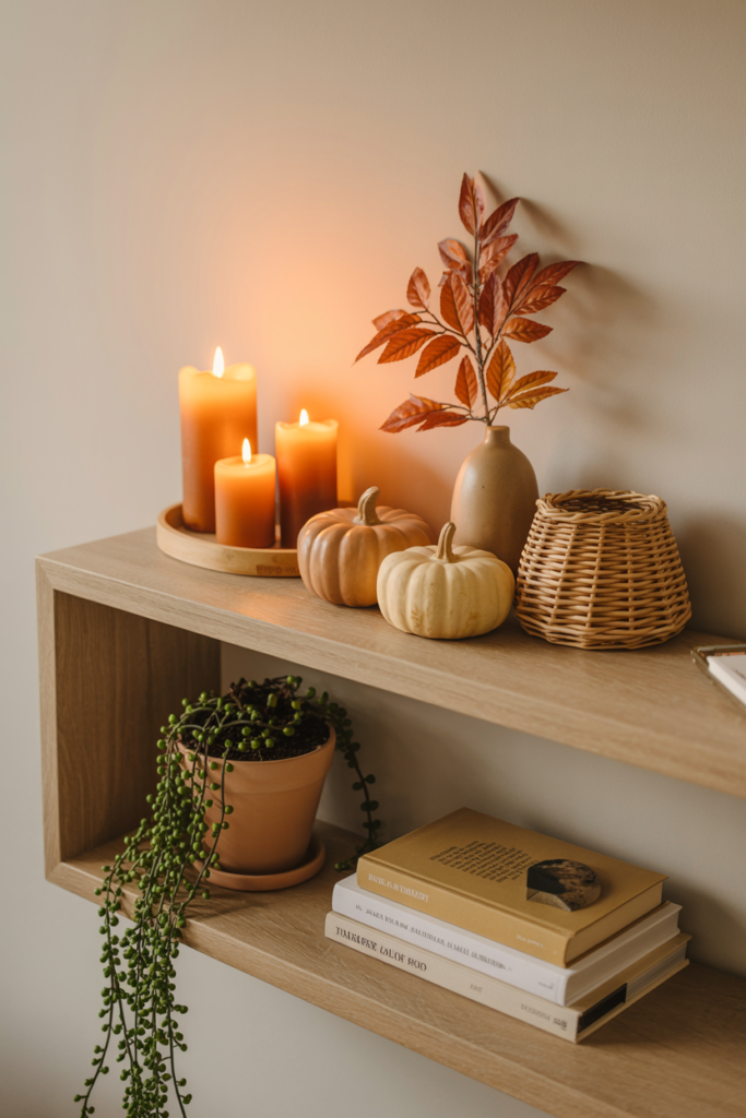
9. Style Shelves With Seasonal Decor Swaps That Keep the Display Fresh and Relevant Throughout the Year
Updating shelf decor with seasonal swaps is one of the most effective ways to keep a home feeling fresh and current without buying new furniture or repainting walls. Swapping in a few seasonally relevant objects, a small pumpkin ceramic and warm amber candle holder for autumn, a pinecone and evergreen sprig arrangement for winter, fresh florals and pastel ceramics for spring, creates an entirely different shelf atmosphere while the foundational objects like books, permanent ceramics, and framed art stay in place. The seasonal objects do all the mood-shifting work while the permanent shelf foundation provides stability and cohesion.
Keeping a small storage box of seasonal shelf decor objects makes the swap process fast and genuinely enjoyable rather than a chore that requires new purchases every few months. Building up a collection of inexpensive seasonal objects over time, a few autumn leaf ceramics, some winter pinecone ornaments, and a set of spring bud vases gives you a rotating inventory that refreshes the shelf display four times a year for essentially no ongoing cost after the initial purchases. That rotation also means you genuinely look forward to getting each set of objects back out each season, rather than tiring of them from year-round display.
Seasonal shelf decor works best when it integrates with the existing permanent palette rather than completely overriding it. Choosing seasonal objects in colors that harmonize with the shelf’s established color palette keeps the seasonal update looking cohesive rather than jarring. Warm autumn tones integrate naturally with a terracotta and cream permanent palette, while cool winter whites and silver tones integrate better with a grey and natural wood permanent foundation.
10. Use Bookends as Decorative Anchor Points That Define Shelf Sections and Add Sculptural Interest
Bookends are one of the most underused shelf decor tools available, largely because most people think of them purely as functional objects that keep books upright rather than as decorative anchor points that define shelf sections and introduce sculptural interest to the arrangement. A pair of well-chosen bookends placed at either end of a book cluster creates a visual boundary that contains the books neatly while adding a design element that contributes to the overall shelf aesthetic. The bookends effectively frame the book section in the same way a picture frame contains and elevates the artwork inside it.
Sculptural bookends in marble, brass, concrete, ceramic, and natural stone suit different shelf aesthetics and add material variety to arrangements that might otherwise consist only of books, plants, and small vases. Brass animal bookends add a playful, eclectic quality to a shelf, marble geometric bookends add a modern and luxurious quality, and concrete architectural bookends add an industrial and contemporary quality. The bookend choice communicates something specific about the shelf’s aesthetic personality, so choosing them deliberately rather than defaulting to whatever is most affordable produces a significantly better result.
Using a single large sculptural object as a one-sided bookend rather than a matched pair creates a more casual and relaxed shelf arrangement than traditional matched bookends. A large ceramic vase, a heavy stone sculpture, or a substantial wooden object placed at one end of a book cluster holds the books in place while reading as a decorative focal point rather than a functional bookend. That dual role of functional anchor and decorative feature is the ideal quality in any shelf object.
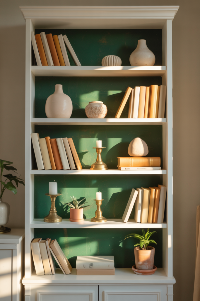
11. Paint the Back of the Shelf or Bookcase a Contrasting Color to Create Depth and Make Objects Pop
Painting the back panel of a bookcase or the wall behind floating shelves in a contrasting color is one of the most transformative shelf styling upgrades available without purchasing a single new object. A dark navy, forest green, terracotta, or charcoal back panel creates a colored backdrop that makes every object on the shelf read more clearly and with more visual impact than objects displayed against a standard white or wood-tone back. The colored backdrop adds depth to the shelf arrangement and gives the whole bookcase a custom, furniture-quality appearance that flat-back versions rarely achieve.
The contrast between the shelf objects and the back panel color drives the visual impact of this technique, so choosing a backdrop color that works with the existing object palette rather than against it matters enormously. Cream and natural wood objects read beautifully against a deep navy or forest green backdrop. White ceramics and brass objects pop against a charcoal or dark terracotta backdrop. Colorful book spines read most clearly against a neutral warm white or light grey backdrop that lets the individual spine colors stand out without competing with a strong background tone.
This technique works equally well on freestanding bookcases, built-in shelving units, and floating shelf arrangements where the wall behind the shelf provides the painted backdrop rather than a back panel. Painting a defined rectangle of wall color directly behind a floating shelf installation creates a framed backdrop effect that makes the shelf look like a deliberate wall feature rather than a utilitarian storage addition. That framed backdrop approach suits contemporary and minimalist shelf styling particularly well.
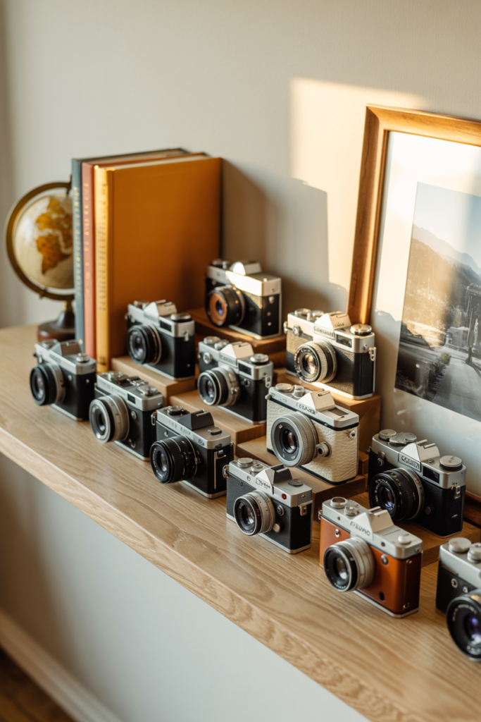
12. Display a Personal Collection as the Shelf’s Main Feature to Create a Meaningful and Unique Display
Centering a shelf display around a personal collection, whether vintage cameras, ceramic animals, travel souvenirs, pressed botanicals, or antique books, creates a shelf story that no amount of purchased shelf styling accessories can replicate. A collection tells a genuine story about the interests, travels, and personality of the person who assembled it, which gives the shelf display an authenticity and meaning that purely aesthetic arrangements often lack. The best shelf displays in any home are always the ones where a real collection forms the heart of the arrangement.
Displaying a collection effectively on a shelf requires editing it down to the best and most visually interesting pieces rather than showing everything simultaneously. Even a collection of fifty vintage cameras reads better as a shelf display when the fifteen most visually striking examples appear on the shelf while the rest rotate in and out seasonally or stay in storage. That editing process produces a display that feels curated and intentional rather than a comprehensive inventory of everything owned.
Mixing collection pieces with complementary non-collection objects prevents the shelf from looking like a single-theme display case and roots the collection within a broader decorating context. A vintage camera collection displayed alongside a few travel books, a small framed map, and a plant creates a shelf narrative about travel and exploration that the cameras alone could not tell as completely. Those supporting objects provide context and visual variety that make the collection more interesting to look at over time.
How to Approach Shelf Styling in a Way That Feels Personal, Balanced, and Easy to Maintain Over Time
Shelf styling works best when it starts with editing rather than shopping. Before adding any new objects to a shelf, pulling everything off and starting from a blank surface gives a much clearer picture of what the shelf actually needs than trying to style around what is already there. A blank shelf reveals the proportions, the back panel color, and the available space in a way that a cluttered one never does, and that clarity makes every subsequent styling decision easier and more confident.
Building the shelf arrangement in layers, starting with the largest objects first, then filling in with medium objects, then finishing with small accent pieces, mirrors the way professional interior stylists approach any shelf project. The large objects establish the composition’s basic structure and height rhythm, the medium objects fill the main visual areas, and the small objects add the fine detail and finishing touches that make the arrangement feel complete. Reversing that order and starting with small objects almost always produces a cluttered, directionless result that requires starting over.
| Shelf Styling Element | Visual Impact | Cost to Implement | Difficulty Level |
| Color Palette Consistency | Very High | Zero | Easy |
| Negative Space | Very High | Zero | Medium |
| Varying Object Heights | High | Zero | Easy |
| Living Plants | High | Low | Easy |
| Painted Back Panel | Very High | Low | Easy |
| Framed Art Layering | High | Low to Medium | Easy |
| Natural Textures | High | Low to Medium | Easy |
| Personal Collections | Very High | Zero | Medium |
| Seasonal Swaps | High | Low | Easy |
| Sculptural Bookends | Medium | Low to Medium | Easy |
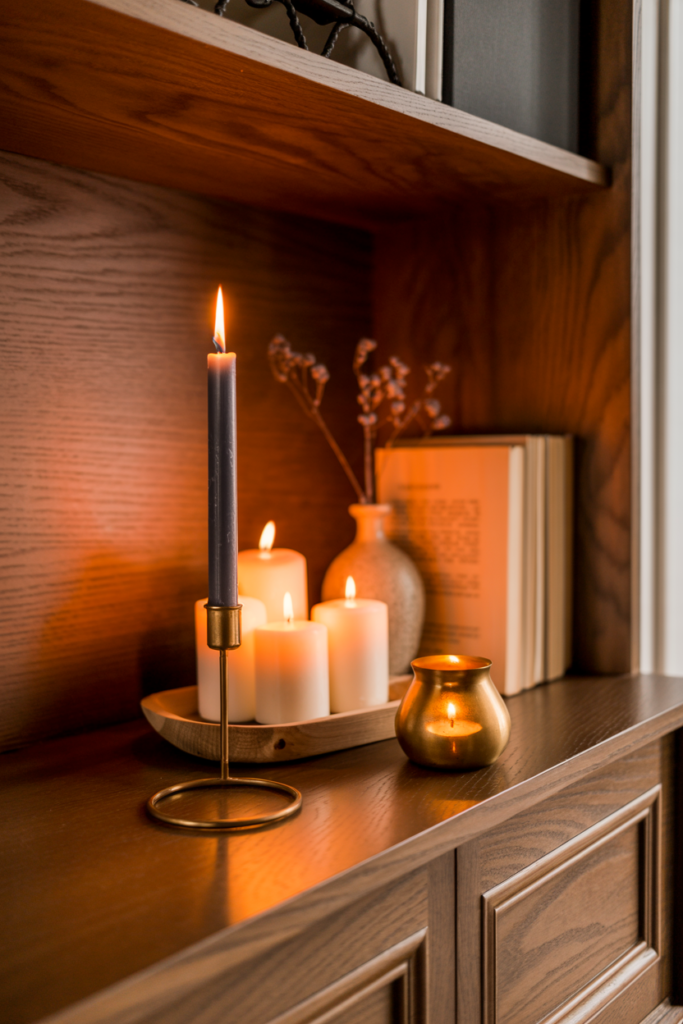
13. Use Candles and Candleholders as Shelf Decor That Adds Warmth, Height Variation, and Evening Atmosphere
Candles and candleholders are among the most versatile shelf decor objects available because they contribute to the arrangement visually during the day and functionally in the evening when lit, which means they earn their shelf space twice over. A tall taper candle in a slender iron holder adds significant height to a shelf vignette without occupying much horizontal space, while a cluster of three pillar candles on a small tray creates a low, dense focal point that anchors a shelf section with warmth and texture. That flexibility of scale and height makes candles genuinely useful across different shelf sizes and arrangement styles.
Choosing candleholders in materials that suit the overall shelf palette ties the candle elements into the broader arrangement rather than making them look like afterthoughts. Iron candleholders suit rustic, industrial, and farmhouse shelf aesthetics, while brass and gold holders suit traditional, eclectic, and maximalist arrangements. Ceramic candleholders in neutral tones suit contemporary and organic shelf styles, and marble or concrete holders suit modern and minimalist aesthetics. The material choice connects the candle element to the surrounding objects in a way that makes the arrangement feel cohesive from every angle.
Battery-operated flameless candles in realistic wax finishes work particularly well on shelves where open flames create a safety concern near books, paper, or dried botanicals. Modern flameless options flicker convincingly and come in a wide range of heights, colors, and finishes that look completely authentic in a styled shelf arrangement. The practical safety advantage of flameless candles makes them a genuinely sensible choice for bookcase shelves where the surrounding material presents a fire risk.
14. Mix Closed Storage Baskets and Boxes With Open Display Objects to Balance Practicality With Beauty
Combining open display objects with closed storage containers like baskets, boxes, and lidded ceramics on the same shelf creates an arrangement that balances the visual appeal of a styled display with the practical reality that shelves also need to hold things that are not particularly beautiful. A small woven basket on a lower shelf section holds remote controls, chargers, or small miscellaneous items completely out of sight while contributing a natural texture element to the overall shelf composition from the outside. That dual function of hidden storage and visible texture makes baskets one of the smartest shelf decor investments available.
Linen-covered boxes, wooden boxes with decorative lids, and ceramic containers with fitted covers all serve the same hidden storage function while adding a more finished and decorative quality than an open basket. Choosing boxes and containers in colors and materials that suit the shelf’s established palette keeps the storage elements integrated into the overall display rather than looking like a practical concession within an otherwise decorative arrangement. A linen storage box in the same warm cream tone as the surrounding books and ceramics reads as part of the composition rather than apart from it.
Positioning closed storage containers on lower shelf sections rather than at eye level makes practical sense because lower shelves naturally receive less visual attention and suit the more utilitarian role of hidden storage better than the prominently visible eye-level sections. The eye-level and upper shelves carry the most visual weight in any bookcase arrangement and deserve the most carefully chosen open display objects, while the lower sections handle the practical storage function with closed containers that keep the overall arrangement looking tidy.
15. Style Shelves With a Hero Object as the Clear Focal Point and Build the Surrounding Arrangement Around It
Every well-styled shelf benefits from one hero object, a single piece that commands more visual attention than everything else on the shelf and serves as the anchor around which the rest of the arrangement builds. The hero object could be a large ceramic vase, a sculptural figurine, a significant piece of artwork, a meaningful travel souvenir, or any object with enough visual presence to hold its own as the clear focal point of the arrangement. Identifying the hero object first and positioning it deliberately within the shelf composition before adding anything else produces a more cohesive and intentional result than assembling objects and hoping a focal point emerges organically.
Hero objects work best positioned slightly off-center rather than at the exact middle of the shelf, and at a height that places them visibly above the surrounding objects so they read as the dominant element in the composition. A large sculptural ceramic vase positioned one-third of the way along a shelf with smaller supporting objects grouped around it creates a natural visual hierarchy where the eye finds the hero first and then explores the surrounding arrangement. That clear visual hierarchy makes a shelf arrangement easy to read and genuinely satisfying to look at from across the room.
Supporting objects grouped around the hero piece should complement rather than compete with it in terms of color, scale, and visual weight. If the hero object is a bold terracotta ceramic with a strong sculptural presence, the surrounding objects benefit from being smaller, quieter, and more neutral so they frame the hero rather than distract from it. Plants, small books, and simple vases in colors drawn from the hero piece create a supporting cast that reinforces the focal point rather than fragmenting the viewer’s attention across multiple competing elements.
The Bottom Line on Shelf Decor Ideas That Make Every Bookcase and Floating Shelf Look Genuinely Stunning
Shelf styling is one of those decorating skills that improves dramatically with practice and a clear understanding of a few foundational principles. The fifteen ideas on this list give you every tool you need to transform any shelf from a storage surface into a genuine design statement, starting with the basics of color palette and negative space and moving through texture, plants, art layering, hero objects, and seasonal updates. Every one of these techniques costs little to nothing to implement if you already own a reasonable collection of books and objects.
The most important shift in shelf styling thinking is moving from a storage mindset to a curation mindset. Storage thinking asks how much can fit on the shelf, while curation thinking asks what should appear on the shelf and how those chosen objects relate to each other visually. That single change in perspective produces shelf arrangements that look designed rather than filled, and that distinction is exactly what separates a shelf that people notice and admire from one that simply holds things without comment.
Start with one shelf rather than trying to restyle every surface in the home simultaneously. Edit everything off the shelf, identify your two or three best objects to use as anchors, establish a color palette, and build the arrangement from there using the layering and height variation principles from this list. One beautifully styled shelf in a living room does more for the overall feel of the space than ten mediocre shelves throughout the home, and the confidence and skill gained from that first successful styling project carries naturally into every subsequent shelf you approach.
Frequently Asked Questions About Shelf Decor Ideas for Bookcases and Floating Shelves
How do I start styling a shelf if I feel overwhelmed by where to begin? Start by removing everything from the shelf completely and working from a blank surface rather than trying to style around existing objects. Choose your two or three best objects first and position them as anchors before adding anything else. Building from a blank shelf with a small number of anchor pieces produces a far more confident result than rearranging a cluttered shelf incrementally.
How many objects should I put on a shelf to avoid it looking cluttered? A general guideline is to fill around sixty to seventy percent of the shelf surface and leave the remaining thirty to forty percent as deliberate negative space. The specific number of objects depends on their individual sizes, but erring on the side of fewer, better objects consistently produces cleaner and more professional-looking shelf arrangements than maximizing the number of pieces displayed.
What is the best way to style books on a shelf decoratively? Grouping books by color creates the most visually striking and cohesive book arrangement on any shelf. Mixing upright book clusters with horizontal stacked book piles adds height variation and provides flat platform surfaces for small decorative objects. Turning books with clashing or distracting spines backward so only the page edges face outward creates neutral texture sections that balance bolder decorative elements nearby.
What plants work best as shelf decor in low-light indoor environments? Pothos, ZZ plants, small peace lilies, and snake plants in compact sizes all handle the low-light conditions typical of interior shelves reliably without requiring frequent relocation. Trailing varieties like pothos and string of pearls add the downward movement that makes shelf plant styling particularly dynamic and visually interesting. Air plants require no soil or pot and suit shelf environments very well when placed in small glass globes or ceramic holders.
How do I make a shelf look more expensive without buying new objects? Painting the back panel of a bookcase in a deep contrasting color immediately elevates the entire shelf’s visual quality without purchasing anything new. Editing the existing object collection down to the best pieces and introducing deliberate negative space between vignette clusters creates a curated quality that packed shelves never achieve. Grouping objects by color and varying their heights consistently across the shelf produces a styled result that reads as professionally designed, regardless of the individual objects’ price points.
How often should I update or restyle my shelves? Seasonal updates four times a year keep shelf displays feeling fresh and relevant without requiring constant attention. Swapping in a small number of seasonally relevant objects while keeping the foundational palette and permanent objects in place achieves the refresh effect efficiently. Beyond seasonal updates, restyling a shelf whenever it starts to feel stale or cluttered, rather than on a fixed schedule, keeps the process enjoyable rather than obligatory.
What is a hero object in shelf styling, and how do I choose one? A hero object is the single most visually dominant piece on a shelf that serves as the clear focal point around which the rest of the arrangement builds. Choose the object with the most visual presence from your existing collection, whether through size, sculptural quality, color, or personal significance. Position it slightly off-center at a height that places it above the surrounding objects so it reads as the anchor of the composition before any other objects are added.