
Introduction
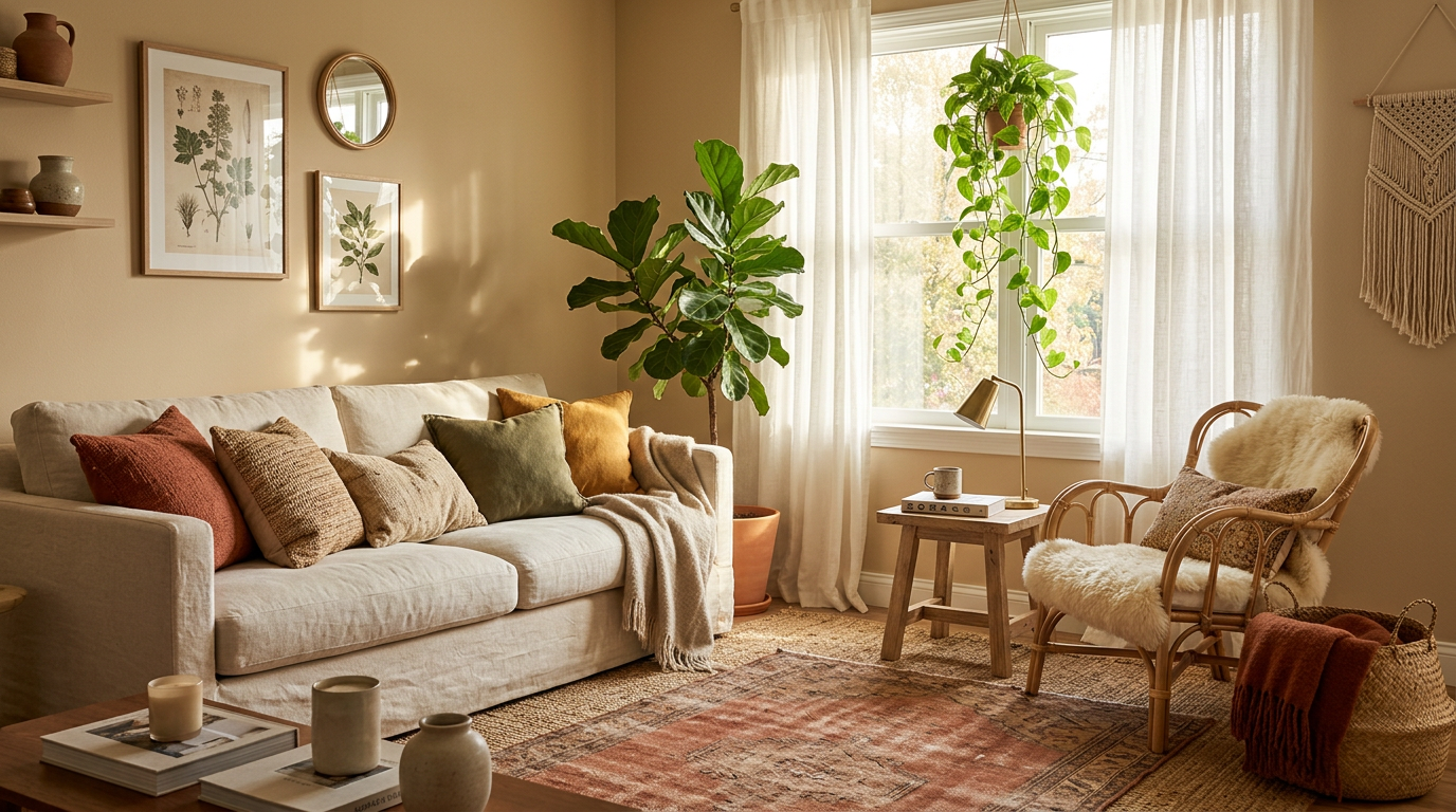
Warm neutrals, terracotta, sage green, and mustard make the best boho living room color palette. They feel earthy, relaxed, and a little bit free-spirited. They also play nicely with rattan, plants, and wood.
I love a boho room that looks collected over time, not ordered from one catalog page. Color does most of that work. The right palette makes a mix of rugs, pillows, and baskets feel like a plan instead of a yard sale.
Below, I share 7 boho color palette ideas with simple tips on wall color, fabrics, and accents. Pick the one that fits your light, your furniture, and your tolerance for throw pillows.
How to Build a Boho Living Room Color Palette: 4 Simple Rules
Start with one calm base color. A soft cream, sand, or warm white covers your walls and big furniture. This base keeps a boho room from feeling busy.
Add one or two supporting colors next. Terracotta, olive, and clay pink all sit well beside warm neutrals. I’d choose colors that share the same warm undertone, since mixing warm and cool tones can look messy.
Finish with small pops of a bolder shade, and test every color in your own light. Paint a sample patch and check it in the morning and at night. A north-facing room often makes colors look cooler and grayer than they do in the store.
The classic 60-30-10 rule keeps things balanced, and boho rooms bend it a little.
| Role | Share of Room | Boho Example |
|---|---|---|
| Base color | About 60% | Cream walls, a sand-toned sofa |
| Supporting color | About 30% | Terracotta rug, olive curtains |
| Accent color | About 10% | Mustard pillows, plants, brass |
1. Warm Neutrals: The Best Calm Base for a Boho Living Room
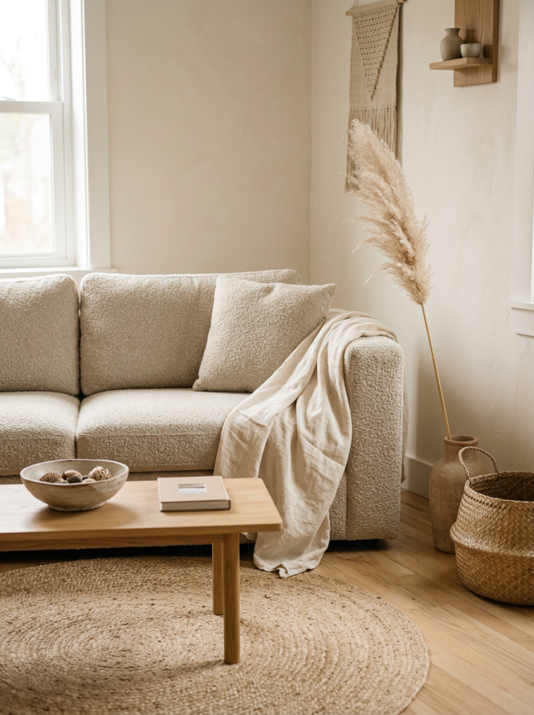
Cream, oatmeal, sand, and soft tan form the easiest boho foundation. They work like a quiet backdrop for patterned rugs, woven baskets, and wooden furniture.
I like to check the undertone before I buy paint. A white with a yellow or beige undertone feels cozy, while a white with a gray or blue undertone can feel chilly. Hold a few swatches next to your sofa and floor to see which one blends.
Layer different textures instead of different colors. Linen, bouclé, jute, and cotton all look rich in the same shade. This keeps a neutral room from feeling flat, and it works well in a small living room.
2. Terracotta and Cream: A Top Earthy Pairing With Warm Character
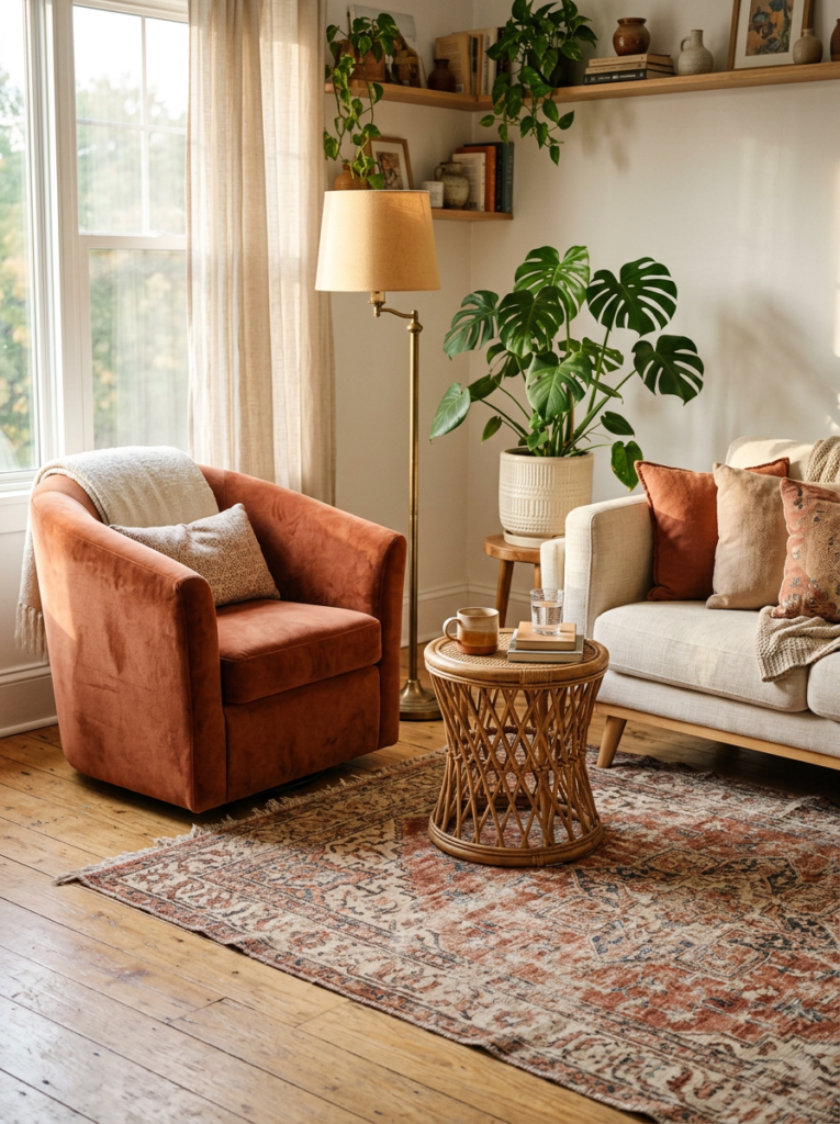
Terracotta brings that sun-baked, desert feel that many people want in a boho room. Paired with cream, it feels warm without turning heavy.
I’d use terracotta on one or two big pieces, such as an accent wall, a rug, or a velvet armchair. Add a few smaller touches in rust and clay, then let cream carry the rest. Too much terracotta can make a room feel like the inside of a flowerpot.
Wood, rattan, and brass fit this palette well. A potted plant with green leaves also stands out against the orange tones. Keep the metals warm, since cool chrome clashes with this look.
3. Sage and Olive Green With Natural Wood: A Fresh, Calm Palette
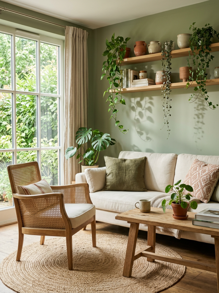
Sage and olive green give a boho room a soft, garden-like mood. They pair well with light wood, cane, and woven textures.
I like sage on walls and olive on cushions or curtains. That gives you two shades of the same color family without a harsh jump. Warm white trim and a cream rug keep the green from looking dull.
This palette suits a living room with lots of houseplants, since the real leaves blend into the walls. It also works nicely in rooms with a lot of natural light. In a dim room, pick a lighter sage so the space doesn’t feel gloomy.
| Idea | Main Colors | Best For |
|---|---|---|
| Warm neutrals | Cream, oatmeal, sand | Small rooms, calm spaces |
| Terracotta and cream | Rust, clay, warm white | Sunny, cozy rooms |
| Sage and olive green | Sage, olive, light wood | Plant lovers, bright rooms |
4. Mustard and Warm Brown: A Top Choice for a Cozy, Retro Boho Mood
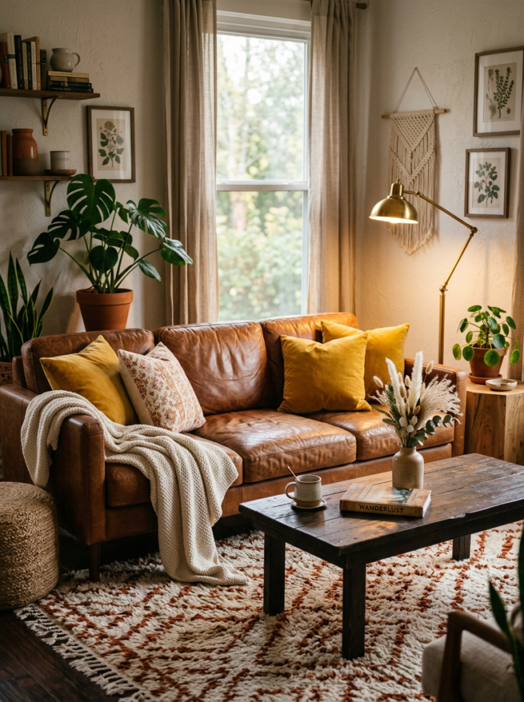
Mustard yellow adds a sunny, seventies feel to a boho living room. Paired with warm brown leather and wood, it turns a plain room into a cozy one.
I’d use mustard in small to medium doses, such as pillows, a throw blanket, or a single armchair. A whole mustard wall can feel loud and tiring. Let cream and tan do the heavy lifting.
A tan or cognac leather sofa suits this palette very well. Add a rust or cream patterned rug to link the colors. Brass lamps and dried pampas grass finish the look.
5. Dusty Pink and Clay: The Best Soft, Romantic Boho Palette
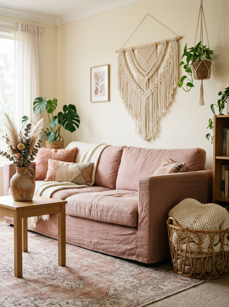
Dusty pink and clay create a gentle, warm mood without turning sweet. They feel closer to sunset than to a nursery.
I like pairing them with cream walls and natural wood furniture. A blush pillow, a clay vase, and a faded pink rug look lovely together. Keep the pink muted and a little brown-toned, since bright pink fights the earthy style.
Add some texture so the colors don’t look flat. Macramé, rattan, and linen all suit this palette. A single dark accent, such as a black picture frame, adds a bit of contrast.
6. Dark Teal and Warm Wood: A Bold Jewel-Tone Boho Look
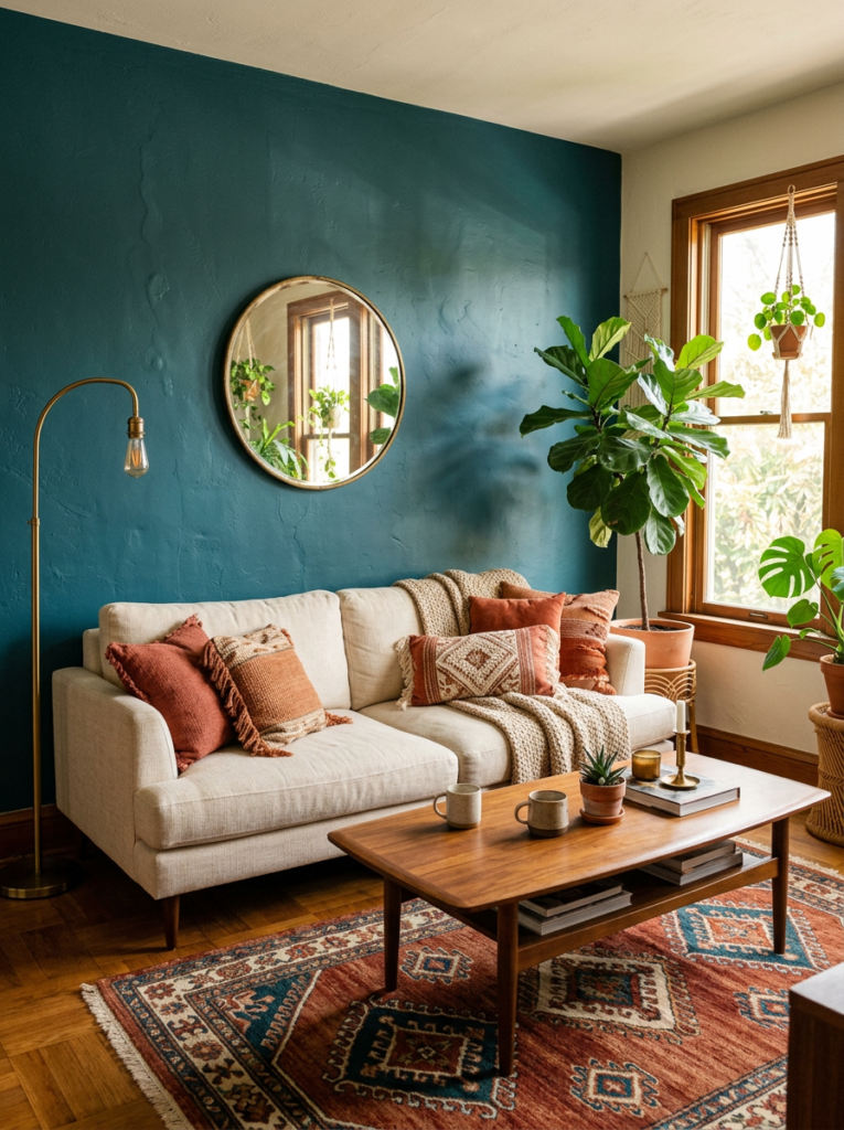
Dark teal gives a boho living room a rich, cozy edge. It brings in a cooler shade that still plays well with warm wood and brass.
I’d use teal on one wall, a sofa, or a set of curtains. Warm neutrals and terracotta pillows balance the cool tone nicely. Without that warmth, a teal room can feel heavy and cold.
This palette works best in a room with good light. Add plants, a patterned rug, and a few mirrors to bounce light around. In a small, dim room, keep teal to pillows and art.
| Idea | Main Colors | Best For |
|---|---|---|
| Mustard and warm brown | Mustard, tan, cognac, cream | Retro, cozy rooms |
| Dusty pink and clay | Blush, clay, cream, wood | Soft, romantic rooms |
| Dark teal and warm wood | Teal, brass, terracotta, oak | Bold, bright rooms |
| Black and natural fiber | Black, sand, jute, white | Modern boho rooms |
7. Black Accents With Natural Fibers: A Smart Modern Boho Palette
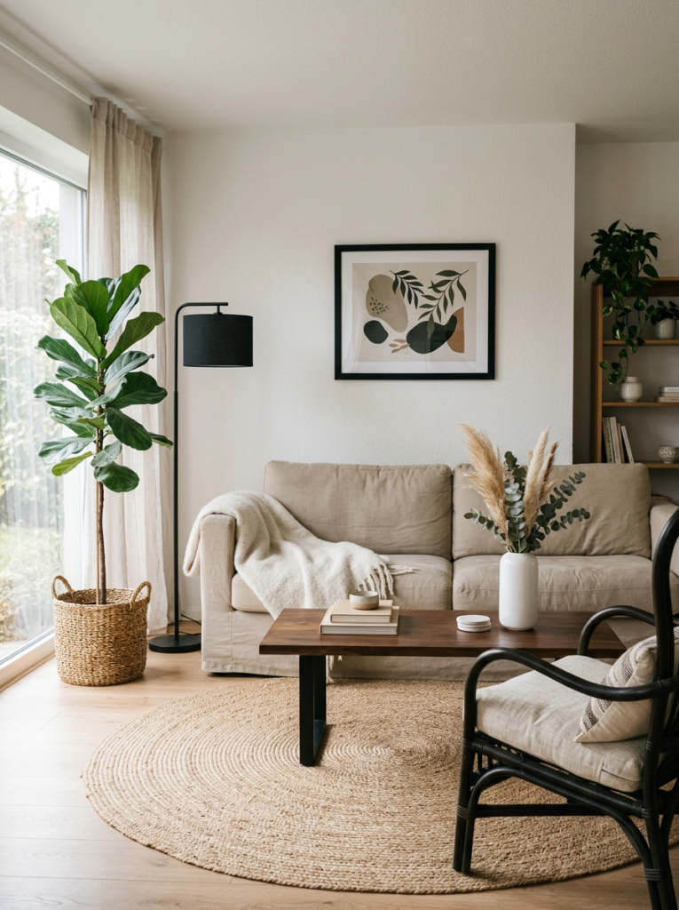
Black accents sharpen a boho room and keep it from looking too soft. Pair them with sand, white, and woven textures for a clean, modern boho feel.
I’d choose small black pieces, such as a metal lamp, a picture frame, a coffee table leg, or a rattan chair with a dark finish. Three to five black items spread around the room look balanced. Any more and the space starts to feel heavy.
Jute rugs, cane furniture, and linen curtains soften all that black. A few green plants add life. This palette suits people who love boho style but want a calmer, tidier room.
5 Common Boho Color Palette Mistakes and Simple Fixes
Using too many colors tops my list of mistakes. A boho room feels layered, not chaotic. Stick to three or four colors and repeat them around the room.
Mixing warm and cool undertones causes the next problem. A yellow-toned cream next to a gray-toned beige looks off. Hold your fabric and paint samples together in daylight before you buy.
Skipping texture leaves a room flat. A palette of soft tones needs wood, rattan, linen, and wool to add depth. Think about what you touch, not just what you see.
Ignoring natural light changes how your colors look. A north-facing room turns warm shades cooler, while a sunny room can wash out pale ones. Test a paint sample on two walls and check it all day.
Forgetting the floor and furniture is the last slip. Your wood tone, sofa color, and rug all count as part of the palette. Lay them out together before you pick wall paint.
| Mistake | Simple Fix |
|---|---|
| Too many colors | Limit the palette to 3 or 4 shades |
| Mixed undertones | Match warm with warm, cool with cool |
| Flat, plain textures | Layer wood, rattan, linen, and wool |
| Skipping light tests | Check swatches morning and night |
| Ignoring floors and furniture | Plan the palette around what you already own |
Conclusion: Pick the Boho Palette That Fits Your Light and Your Style
Warm neutrals, terracotta, sage green, and mustard make the best boho living room color palette. They feel earthy, relaxed, and easy to layer with wood, rattan, and plants.
Start with one calm base, add one or two supporting colors, and finish with small pops of a bolder shade. Dusty pink suits a soft, romantic room, dark teal adds a rich edge, and black accents give a modern twist. Stick to three or four colors and repeat them around the room.
Match your undertones and test every swatch in your own light. Layer texture to keep the room warm and interesting. Get those basics right and your boho space will look collected, not cluttered.
FAQs About Boho Living Room Color Palettes
1. What colors make a boho living room color palette?
Warm neutrals, terracotta, sage green, mustard, dusty pink, and dark teal all work well. They share earthy, warm undertones. Pick one base color and add one or two supporting shades.
2. What is the best wall color for a boho living room?
Cream, warm white, sand, and soft beige work best. They keep the room bright and let rugs, pillows, and art stand out. Sage green and clay pink also suit boho walls.
3. How many colors should a boho room have?
Stick to three or four colors. Use one base, one or two supporting shades, and a small accent. Repeating each color around the room makes the space feel planned.
4. Can I use bright colors in a boho living room?
Yes, but use them in small doses. A mustard pillow or a teal throw adds energy without taking over. Keep the bolder shades muted and warm to fit the earthy style.
5. What colors go with a terracotta sofa or rug?
Cream, sand, olive green, and warm brown all pair nicely. Brass and natural wood add warmth. Avoid cool chrome and icy blues, which clash with the earthy tone.
6. How do I stop a boho room from looking too busy?
Limit your colors and repeat them. Layer textures such as linen, jute, and wool instead of adding more patterns. Keep the walls and large furniture in a calm neutral.
7. What color boho palette suits a small living room?
Warm neutrals and soft sage work best in small rooms. Light shades bounce daylight around and make the space feel larger. Add bold color through pillows, art, and plants.