If you want a bedroom that feels calm, clean, and put-together, color is everything. Most interior designers will tell you the same thing: it’s not about having no color, it’s about choosing the right color and using it the right way. That one rule alone can change how your entire room feels the moment you walk in.
I’ve seen bedrooms with expensive furniture that still felt chaotic. And I’ve seen simple, budget rooms that felt like a luxury hotel. The difference? A smart, intentional color palette. That’s the minimalist color rule in action.
The idea is simple: pick one dominant neutral, one soft secondary tone, and let texture do the rest. No loud patterns, no color clashes, no “what was I thinking” moments three months later. Just a room that breathes.
Why Minimalist Bedroom Colors Work Better Than You Think
The Science Behind Calm Colors
Color affects your brain more than most people realize. Studies in environmental psychology show that softer, muted tones lower cortisol levels and help your nervous system wind down faster. That’s exactly why minimalist bedrooms tend to feel so restful.
Warm whites, soft greiges, dusty blues, and sage greens are not just trendy. They’re genuinely calming to the human eye. When your brain isn’t busy processing visual noise, it can relax. And a relaxed brain means better sleep, better mornings, and a better mood overall.
I think of it this way: your bedroom should feel like a mental exhale. The right minimalist color palette makes that happen without you even noticing it’s working.
How the 60-30-10 Color Rule Applies to Minimalist Bedrooms
The 60-30-10 rule is a classic interior design principle, and it works beautifully in a minimalist bedroom. Here’s how it breaks down:
| Color Role | Percentage | Example in a Minimalist Bedroom |
| Dominant Color | 60% | Wall color (warm white, soft beige, greige) |
| Secondary Color | 30% | Bedding, curtains, upholstered headboard |
| Accent Color | 10% | Throw pillows, a plant, a lamp, or a small decor piece |
This rule keeps the room visually balanced without making it feel empty or sterile. You’re not stripping the room of personality. You’re just giving each color its own lane.
Why Most People Get Minimalist Colors Wrong
The biggest mistake I see is people confusing minimalist with colorless. They paint everything stark white, remove every soft element, and wonder why the room feels cold and uncomfortable. That’s not minimalism. That’s just… sad.
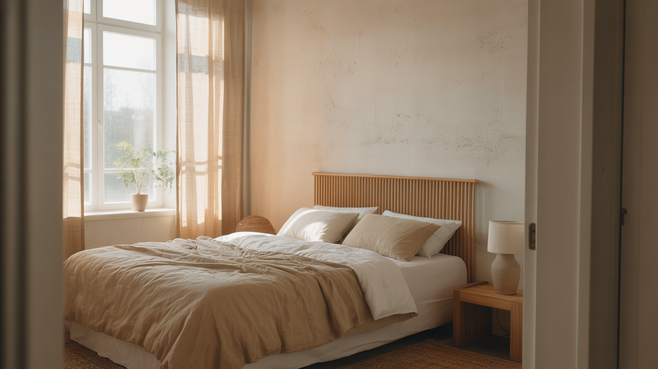
True minimalist color design uses warmth. It uses depth. A soft ivory wall with linen curtains and a warm oak nightstand has layers, even if it all looks neutral at first glance. The tones play off each other in a way that feels intentional and cozy.
The goal is a room that looks simple but feels rich. That balance is what separates a well-designed minimalist bedroom from one that just looks unfinished.
The Best Minimalist Bedroom Color Ideas That Interior Designers Actually Use
1. Warm White: The Classic That Never Gets Old
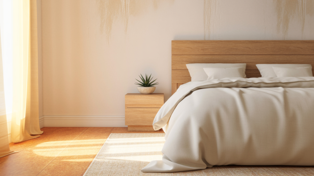
Warm white is the foundation of almost every minimalist bedroom I admire. It’s not the cold, clinical white you’d find in a hospital. It’s softer, creamier, and far more livable. Shades like Benjamin Moore’s “White Dove” or Sherwin-Williams “Alabaster” are popular for a reason.
The beauty of warm white is how well it reflects natural light. It makes even a small bedroom feel open and airy without doing much else. Pair it with natural wood tones and linen bedding, and the room practically styles itself.
I personally think warm white is the safest starting point if you’re new to minimalist design. It gives you a clean canvas and works with almost any secondary color or texture you bring in later.
2. Greige: The Color That Does Everything Right
Greige is that perfect middle ground between gray and beige, and it’s one of the most versatile minimalist bedroom colors out there. It’s warm enough to feel cozy but cool enough to feel modern. That balance is hard to find in a single paint shade.
What makes greige so popular among designers is its ability to adapt. In natural daylight, it reads soft and warm. In evening lighting, it picks up cooler, more sophisticated undertones. Your bedroom essentially shifts mood with the time of day.
If you want a color that works without constant second-guessing, greige is it. Try shades like “Accessible Beige” by Sherwin-Williams or “Revere Pewter” by Benjamin Moore for a grounded, elegant feel.
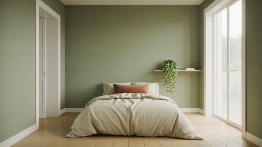
3. Soft Sage Green: Calm, Natural, and Surprisingly Versatile
Sage green has become one of the most requested minimalist bedroom colors in recent years, and I completely understand why. It brings the calming energy of nature indoors without feeling like you’re sleeping inside a greenhouse.
The muted, dusty quality of sage green keeps it firmly in minimalist territory. It doesn’t shout for attention. It just quietly makes the room feel more alive and grounded. Pair it with white trim, warm wood furniture, and cream bedding for a look that feels effortlessly put together.
From a design standpoint, sage green also photographs beautifully. If you ever want your bedroom to look good on camera, this color delivers every single time.
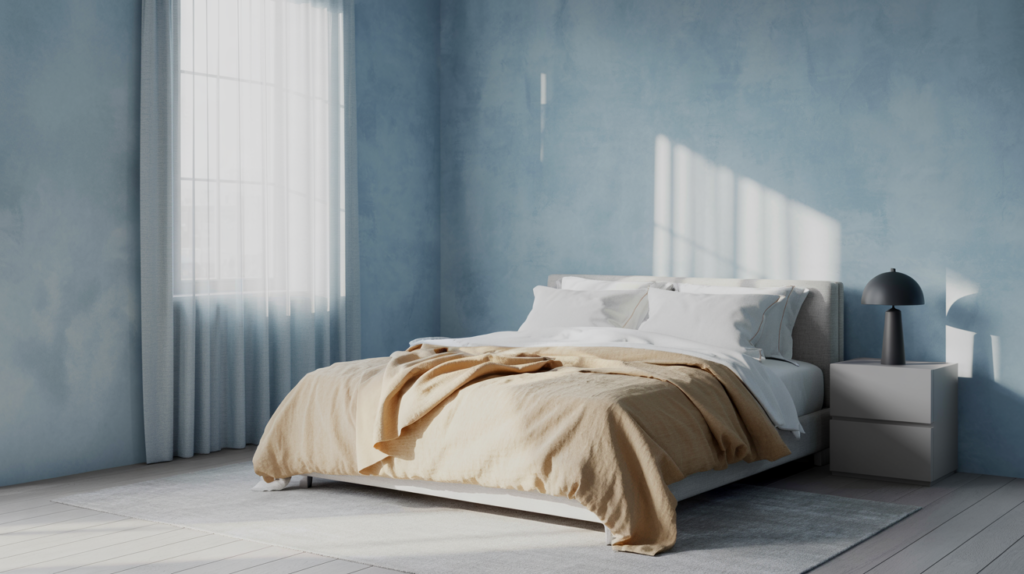
4. Dusty Blue: The Underrated Minimalist Favorite
Dusty blue is soft, muted, and deeply calming. It carries just enough color to add personality without overwhelming the minimalist aesthetic. Think of it less like a bold blue and more like a faded denim that’s been through a hundred washes in the best possible way.
This color works especially well in bedrooms with limited natural light. Unlike darker colors that absorb light and close a room in, dusty blue reflects it gently and keeps the space feeling open. It also pairs beautifully with soft whites, warm linens, and matte black or brushed brass hardware.
I find dusty blue particularly good for people who want a minimalist room that still has a quiet personality. It’s calm without being boring, which is exactly the sweet spot most people are looking for.
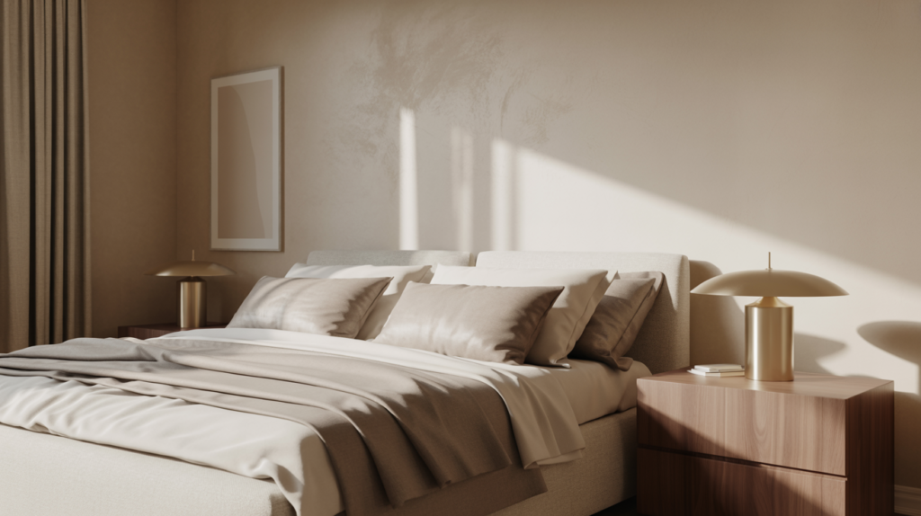
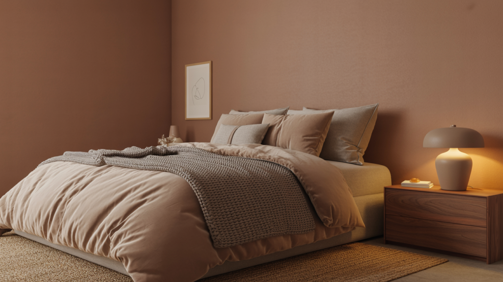
5. Warm Taupe: The Sophisticated Neutral You’re Probably Overlooking
Taupe gets overlooked far too often in minimalist bedroom design, and that’s a shame. It’s one of the richest-feeling neutrals you can use, especially in a bedroom where warmth and comfort matter most.
Warm taupe sits between brown and gray with just enough warmth to feel inviting. It adds depth to a room in a way that flat whites and cool grays simply can’t. Layer it with textured throws, a jute rug, and matte ceramic decor pieces and the result is a bedroom that looks genuinely luxurious.
The best part? Taupe works in almost any lighting condition. Whether your room gets bright morning sun or stays dim throughout the day, taupe holds its warmth and keeps the space feeling cozy and intentional.
6. Charcoal and Off-White: The High-Contrast Minimalist Palette
Most minimalist color advice leans toward light and airy, but a dark minimalist bedroom done right is something else entirely. Charcoal walls with crisp off-white bedding create a sharp, dramatic contrast that feels bold and refined at the same time.
This palette works best in larger bedrooms with good natural light. The charcoal absorbs light, so you need enough of it coming in to keep the room from feeling like a cave. Add warm lighting through bedside lamps and the whole space shifts into something moody and beautiful.
I think this is the most underused minimalist color combination. People assume dark means heavy, but in a well-lit space with clean lines and minimal furniture, charcoal can actually feel freeing.

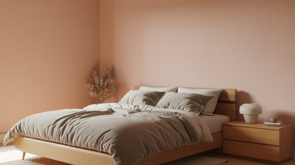
7. Soft Blush: Warm, Subtle, and Far From Feminine
Soft blush often gets dismissed as too feminine for a minimalist bedroom, and that assumption sells it short. When used correctly, blush is one of the warmest and most grounding neutrals in the entire color family.
The key is keeping it muted. A pale, dusty blush on the walls rather than a bright pink reads as a sophisticated warm neutral, especially when paired with gray linen, natural wood, and matte white accessories. The warmth it adds to a room is genuinely hard to replicate with any other color.
I’ve seen blush used in bedrooms styled for couples and the result was always more elegant than expected. It’s a color that rewards subtlety. The less you push it, the better it looks.
Quick Color Comparison: Which Minimalist Shade Suits Your Bedroom?
| Color | Best For | Pairs Well With | Mood It Creates |
| Warm White | Any bedroom size | Wood tones, linen, stone | Fresh, airy, open |
| Greige | Modern or transitional style | Cream, charcoal, brass | Grounded, sophisticated |
| Sage Green | Nature-inspired spaces | White trim, warm wood | Calm, earthy, alive |
| Dusty Blue | Low-light bedrooms | Soft white, warm linen | Peaceful, quiet |
| Warm Taupe | Cozy, layered interiors | Jute, ceramic, matte finishes | Rich, warm, inviting |
| Charcoal | Large, well-lit bedrooms | Off-white, warm lighting | Dramatic, refined |
| Soft Blush | Warm, intimate spaces | Gray linen, natural wood | Soft, elegant, warm |
How to Choose the Right Minimalist Bedroom Color for Your Space
Start With Your Room’s Natural Light
Before you fall in love with a color on a paint swatch, look at your room’s light first. Natural light changes everything. A soft sage green can look fresh and bright in a south-facing room and flat and dull in a north-facing one. Always test a paint sample on your actual wall before committing.
Morning light tends to run warm and golden, while afternoon light is cooler and bluer. If your bedroom gets mostly morning sun, you can lean into cooler tones like dusty blue or soft greige. If it stays dim throughout the day, warmer shades like taupe or warm white will work harder for you.
I always tell people to live with a paint sample for at least two days before making a final decision. Watch how it looks in the morning, in the afternoon, and under your evening lamps. That’s when you really see the true personality of a color.
Match Your Color to Your Existing Furniture
Your wall color doesn’t exist in isolation. It has to work with your bed frame, nightstands, flooring, and any other furniture already in the room. This is where a lot of people go wrong by choosing a color they love in theory but clashes with everything they already own.
If you have warm wood furniture, lean toward warm whites, taupe, or sage green. If your furniture is more modern with cool gray or black tones, greige, dusty blue, or charcoal will complement it better. The goal is harmony, not matching.
A simple trick I use is to hold a paint swatch next to your largest furniture piece and squint. If they look like they belong in the same room, you’re on the right track. If something feels off, trust that instinct.
Don’t Forget the Role of Texture
In a minimalist bedroom, texture carries a lot of the visual weight that pattern and color usually handle in busier spaces. When your palette is neutral and restrained, texture becomes the thing that keeps the room from feeling flat.
Think linen curtains, a chunky knit throw, a woven jute rug, or a bouclé headboard. These elements add depth and warmth without adding visual noise. They make a simple color palette feel layered and considered rather than bare and unfinished.
I’ve found that the rooms that look the best in person are the ones where texture does the heavy lifting. A warm white room with a linen duvet, a wooden nightstand, and a textured rug will always feel more complete than the same room with smooth, plastic-looking surfaces.
Conclusion
The minimalist bedroom color rule that interior designers swear by comes down to one thing: intention. It’s not about removing all color. It’s about choosing the right colors, using them in the right proportions, and letting texture fill in the rest.
Warm white gives you a clean, airy foundation. Greige adds sophistication without effort. Sage green brings in calm, natural energy. Dusty blue creates a quiet, peaceful mood. Warm taupe layers in richness and warmth. Charcoal makes a bold, refined statement. And soft blush adds an unexpected warmth that surprises almost everyone who tries it.
The 60-30-10 rule keeps your palette balanced. Your room’s natural light guides your final color choice. Your existing furniture anchors everything together. And texture is what makes a simple palette feel genuinely beautiful rather than just empty.
If you take nothing else from this, remember this: a minimalist bedroom doesn’t have to feel cold or boring. The right color, used with confidence, makes a room feel like the most restful place in your home. And that’s exactly what a bedroom should be.
Frequently Asked Questions
1. What is the best color for a minimalist bedroom?
Warm white, greige, and soft sage green are among the top choices for a minimalist bedroom. They create a calm, restful atmosphere without making the space feel cold or empty. The best color always depends on your room’s light and your existing furniture.
2. How many colors should a minimalist bedroom have?
Most designers recommend sticking to two to three colors at most. One dominant neutral for the walls, one secondary tone for bedding and curtains, and one subtle accent color for small decor pieces. This follows the 60-30-10 rule and keeps the room visually balanced.
3. Can a minimalist bedroom have color?
Absolutely. Minimalist design is about intentional simplicity, not zero color. Muted, dusty tones like sage green, soft blush, and dusty blue all work beautifully in a minimalist bedroom. The key is keeping the palette cohesive and restrained.
4. Is white too cold for a minimalist bedroom?
Stark, cool white can feel clinical and cold. That’s why most designers recommend warm white instead. Shades with soft yellow, pink, or beige undertones feel far more inviting and work better in a bedroom setting.
5. What accent colors work in a minimalist bedroom?
Warm terracotta, muted olive, soft brass, and natural wood tones all make excellent accent colors in a minimalist bedroom. Use them in small doses through a lamp, a plant pot, a throw pillow, or a picture frame to add warmth without cluttering the space.